Mastering Website Flowcharts
An optimal user flow is crucial for successful websites. Learn how to use flowcharts to achieve clarity early in the UX design process.
Sharing what we've learned while delivering client projects online for more than 20 years and being leading contributors to TYPO3 is part of who we are.
We choose widely-adopted open-source technologies because we can fix, extend, and improve them while building on the experience and support of thousands of our peers. In our blog, we share with you the knowledge we've gained along the way for you to build on.
Read on!
An optimal user flow is crucial for successful websites. Learn how to use flowcharts to achieve clarity early in the UX design process.
People with disabilities constitute one of the most significant segments of online users, but it is an often-overlooked population in the digital world. Increasing accessibility to this population is an empathetic choice and an intelligent business decision, especially when you consider that temporary and situational disability adds up to include almost everyone who uses the internet. Improving accessibility can increase an organization’s reach, enhance the user experience, and boost SEO. Additionally, with new accessibility directives in play, organizations that expand their site’s accessibility will maintain compliance with the law.
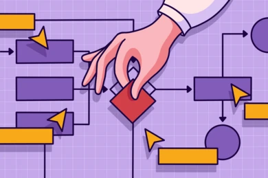
User flow design visualizes the path that the user follows to achieve a specific goal. In digital terms, the path is what the user sees and clicks on when interacting with a digital interface. User flow design defines the sequence of steps and ensures that these steps are intuitive, efficient, and frustration-free for a positive and smooth experience.
In digital design, picking the right user flow tool isn’t just about choice; it’s about navigating challenges like integration issues, team collaboration, and budget constraints. With a sea of options, how do you find one that addresses all these considerations? This guide simplifies and demystifies the process, ensuring you make a decision that truly fits your needs.
Mid-fidelity wireframes serve as a crucial tool in the UX design process, striking a balance between detail and abstraction. This article explores the benefits and uses of mid-fidelity wireframes, demonstrating how they can enhance the design process, facilitate effective communication among stakeholders, and ultimately lead to the creation of more user-centric digital solutions.
Uncover the versatility of Miro in our comprehensive guide! From real-time collaboration to easy client engagement, explore the top 10 reasons why Miro is our go-to tool for UX design.
Discover the power of Figma for UX design. Streamline projects with seamless collaboration, cross-platform accessibility, and innovative features. Elevate your project’s efficiency and transparency
Wireframing is the first step in designing the structure of a website, and it serves many purposes; to describe how information is presented on a page, to determine a website’s structure and how it functions, and to shape the flow of the user journey. Whether you’re interested in an entirely new project or refining an old one, wireframing provides a firmly user-oriented foundation for your site.
Accurately reflecting a brand’s identity and goals through its website is a layered, multi-step process. It requires strategy, technical know-how, and deep understanding of users to create a strong, visually appealing website. Brand designers also need to be in sync with a business’s goals to ensure their digital brand represents their long-term aims.
User experience design strives to create an outstanding experience for the users of your website or web app. But there is more to it. Your company has one or more products, a business plan, employees working in several departments, and various other stakeholders, too.
The user journey is a substantial part of the user experience (UX). If users are unable to complete a task in your app or on your website, their user experience plummets — so does their opinion of your brand. When you notice high bounce rates or low conversion rates, it’s time to act.
Users want to find information fast. If the page navigation is insufficient, they quickly resort to the search functionality. Nowadays, users expect that an on-site search is easy to use, provides flexible options, and delivers specific and useful results. But bringing your on-site search to the next level is not straightforward, because there are many factors that contribute to the overall solution, such as your search engine, content, metadata and your information architecture.
In an ever-evolving technological landscape, keeping your brand and technology up-to-date and competitive can feel like a full-time job. Whether you’re working on a website relaunch, a brand refresh, or a system-wide version update, it’s going to be time-consuming and expensive, not to mention repetitive. When your focus turns instead to future-proofing your website, you ensure your design and technology are ready for anything, now and for the long-term.
The human mind is naturally driven by aesthetics. Interface design, therefore, contributes substantially to building a positive user experience. But when it comes to durability and quality, it's what's on the inside that counts. Although conceptual models are abstract, they let you take a step back and envision how people are going to interact with your product. This distance gives you perspective. Seeing the entire landscape means you can more easily align interactions, relations, transitions, and the functionality of your project. Building an elegant solution underpins a well-made interface.
Site navigation is one of the most important elements of any website, and can greatly impact user experience. Poor navigation can result in shorter site visits and higher bounce rate. The good news: unlike some other UX elements, navigation can be improved relatively quickly. You can address a lot of preliminary issues by following well-accepted usability heuristics. Then go deeper with a thorough analysis of your business goals and user needs to create a site nav that is truly intuitive.
When working with transnational corporate websites in different cultural contexts, it is very important to know the different aspects and demands of your international audience. To make a website optimally available and enjoyable for a wide range of users, you need to look beyond the technical requirements of a CMS only supporting text display and language direction. For your visual design to have a global reach, you need to consider things like aesthetics, symbolism, typography and form construction.
It’s fair to say that there’s a lot of jargon in every industry, but the web seems to have plenty. The misunderstanding about the user interface (UI) versus the user experience (UX) highlights the confusion we often come across in our work. Sometimes customers ask us to build user interfaces, but they haven’t considered the impact on user experience. This quick article explains these terms and why this difference matters.
Previously in this series, we covered the improvements TYPO3 v11 brought to the Page Tree in the post, Resizable Navigation Area in TYPO3. There is one feature in particular that deserves its own shiny spot in our list of new features in TYPO3 v11, and that is the tree functionality within the Element Browser and the Link Picker.
The customer or user experience (UX) of a product is gaining more and more importance in fulfilling business objectives because it's the experience that will set your product apart from the competition.
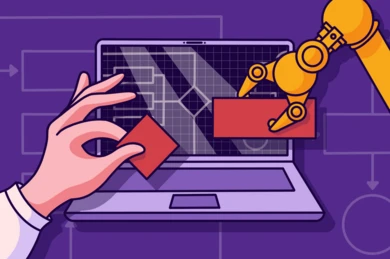
Prototypes are the best way to take your clients through user journeys. Here are b13’s best practices for communicating flows through interactive prototypes.
What is Information Architecture and why does it matter? Information Architecture (IA) is about organizing and structuring the content of websites. It is like a blueprint for the final product, and just as a blueprint of a building is an essential tool for an architect, the IA is an essential part of building a website. Good IA is the foundation for good User Experience (UX). It enables users to effortlessly find the information they need. The best visual design won’t help you if your users can’t navigate through your site. Therefore it’s important to take some time and lay out a plan before starting the design.
The best way to get to know your target audience is to talk to them—really talk to the real users of your product. When time and money are scarce, how can we make sure we still include the user’s perspective in our design process?
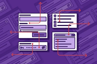
Forms are one of the most common ways to interact with a website, for example signing up for a newsletter, completing a check-out process, contacting a company, or creating an account. It’s important to get the design right.
Forms are a must-have on any website these days; from a simple contact form to a complex multi-page form for data processing. TYPO3 CMS's built-in form functionality has all the answers.
Meet the improved Folder Tree in TYPO3’s File List module, way faster than before. Plus: Now including a filter!
A great website experience starts with typography. Information blocks, heading hierarchy, size, weight and color. We consider typeface form and function to get the best results for our clients.
A good color palette works respects corporate branding, works on screen, and helps all users navigate your site with ease.
We applied atomic design principles with these three practices that have simplified how we work.