
UI Design Basics: Typography

The main purpose of most websites is to convey information, and the primary way to do that is still through the use of text. This makes typography one of the most important aspects of user interface (UI) Design. When looking at typography as part of your site design, there are a few things to keep in mind to ensure that the content on your website is easy to read and understand. There are also some challenges to face, that you won’t encounter in print media.
Choose your fonts
Most of our clients already have a typeface that is stipulated in their corporate branding guidelines. To keep the brand identity consistent across all channels, we always try to use the same fonts when designing their website. However, using a typeface for print and for web is different and it starts with the licencing. The first thing we do is check if our clients are using a free or a licenced typeface. If it’s licenced, we check to see if the web font is included in the licencing agreement.
Infobox
The words “typeface” and “font” are often used interchangeably but they actually are two different things. A typeface refers to the design of the whole family of fonts, like “Helvetica”. A font is then one particular member of that family, like “Helvetica light”.
If we do need to choose new typography for a client, we consider what is a natural fit for their brand and the character of their company. We also consider function and form.
Two different typefaces are great to add interest and to distinguish between headlines and copy text—but pairing fonts can be tricky. You need to make sure they play nicely together.
It’s also important to keep readability in mind when choosing a font. Handwritten or brushed fonts can look great for accents, but are really hard to read for longer blocks of text.
On the rare occasion that we’re free to choose a typeface for a client’s website, we never use more than two, and for each typeface, no more than three different fonts or styles. This gives us enough possibilities to show different information hierarchies while at the same time keeping the overall look consistent.
Create a typographic hierarchy
Hierarchies are very important in any kind of information design. They allow the reader to quickly scan and find relevant content and make a website easily digestible. Typography is a wonderful tool to create these hierarchies in a simple and effective way, but to keep the look of the website consistent we don’t want too many different paragraph styles.
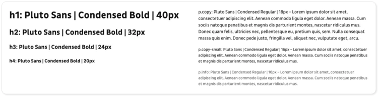
Usually it is enough to define four different headings, copy text in two sizes and maybe an infotext. This gives you around seven different font styles which is a good base to start from. During the design process it’s common that we’ll encounter some exceptions or maybe need to add another heading but just keep in mind that less is more.
To create distinctive hierarchies between these paragraph styles there are three main instruments: size, font weight and colour.
Size
Size is the most obvious way to create hierarchies in a text area. There are a few best practices and usability guidelines that help you choose the right font sizes for your paragraph styles.
Let’s start with the base for all of your font sizes, the size of your copy text. Generally it should not be any smaller than 16px to be easily readable. In fact, if you have a website with long articles it’s better to go with something around 18px up to 20px to make reading longer passages enjoyable for the user. But these sizes are just a rough guide because every font will look slightly different.
Often it is useful to have a second style for copy text that is either a bit smaller or a bit bigger than your main copy text. It can be used for article leads, teaser texts or information boxes for example.
Using the size of the copy text as a basis, we usually start to define four headline styles. The biggest for titles and impactful headlines can be quite dramatic. For the other three we just fill up the scale between the copy text and the largest headline. Always look at your font sizes in context, combine different headings with copy text and see what looks good together. Also think about the context. A level 3 headline will most likely be used in close proximity to copy text so you want to make sure it doesn’t disrupt your reader’s flow.
In addition to these styles you might want to add one more style for small info text like copyright under an image, or explanatory text in a form. This can be quite small but definitely not smaller than 12px for it to be legible.
Note that when you consider font sizes, you’ll always have to consider line height too. As a rule of thumb we like to go for 1.2x the font size for headlines, and 1.5x the font size for copy text. This way the line height is large enough for the reader to easily skip from one line to another, and at the same time small enough to still let a text block look like an actual block.
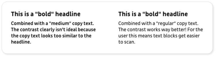
Font weight
Font weight can help to add more impact to your headings and make it easier to distinguish between smaller headings and copy text. When designing for the web it’s best not to go for thin or hairline font weights. They might look okay on your high quality screen but they can be very hard to read on older devices or for people who are visually impaired.
To ensure a nice contrast between the hierarchies, use font weights that are not too similar. And try not to use more than three font weights so that you can keep your website’s look consistent.
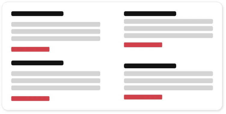
Colour
Colour can be an additional way to communicate hierarchies but it should never be the only way to communicate information, so make sure to combine it with size and/or font weight. If you want to find out more about the use of colour in UI design, read our article “UI Design Basics: Colour”
Put it to use
Now that we have our different paragraph styles defined, it’s time to put them to use on an actual website layout. This means we can check how they will work in the broader context of the site as a whole, and how they work in relation to each other. When trying out your styles, it is always best to use real content if you have it. If not, use dummy content in the intended language of the website. Try to have a mix of different word counts and sentence lengths to really test out your styles in a number of different contexts. Two things to consider when road testing your styles are text layout and spacing.
Text Layout
For languages that read from left to right, always use left aligned text to achieve the highest possible readability. Use centered text judiciously. It can look nice as an accent, but the ragged starting edges make it harder for your eye to track from one line to the next. Try to stay away from justified text. Fully justified text can look good in print where you can adapt every paragraph manually, but on the web this is bound to lead to awkward spaces in your lines.
Another thing to keep in mind is the actual width of your text lines. This is something we often encounter on the web and it often makes me shake my head in disbelief. Have you ever tried to read a long article on a website that uses the full width of the window for the text? This is going to be very tiring for any reader. Best practice for readable content is to limit the line length to about 70 to 80 characters. This is especially important if you have longer pieces of content on your website like blog articles.
Spacing
Spacing can be a tricky business, more so if you want to make it consistent throughout a whole design system. But that is a story for another time. For now we’ll just focus on the spacing between your typographic elements. The most important thing here is to group elements that belong together. This makes it easier for the reader to scan and comprehend content blocks. It might sound easy enough but it has a big impact.
Conclusion
If you keep these things in mind you’re well on your way to showcase your content online in a readable and attractive way, and the chances of users actually reading and understanding your content are higher. Well-executed typography really is the base of a stunning web design, so we always make sure to get this 100% right. This article only touches the surface of the topic so if you feel like the typographic system of your website has grown out of control over the years, contact us and we’ll find a solution together.