Intuitive Navigation: Streamline Your User Experience
Anticipate your website visitors’ needs and give them just what they’re looking for. It makes a great first impression, optimizes user experience, and adds value to your business.


If your website contains a large amount of content and information that is not properly organized, it can be confusing and overwhelming for your users, causing them to bounce off your site or abandon a workflow.
b13’s tech-savvy UX team knows how to leverage TYPO3’s capabilities to design a navigation structure and information architecture that optimizes a site’s findability, discoverability and usability. Now your customers can instantly discover custom-made offers for them.
Informative and Visual Sitemap Design
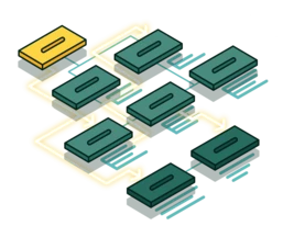
A UX sitemap is a bird’s eye view of how pages are linked, organized and labeled for a website or an application, usually displayed as a hierarchical diagram of linked pages. A well-organized site helps Google and other search engines crawl the site content, which helps with SEO. b13’s UX team paints a clear picture showing you how the website is structured, so you can make important design decisions.
Show clear information hierarchies
Categorization of site content
Build foundations for the website navigation concept
Initial definition of the website interface
Clear, Extensive Navigation and Search Concept
Intuitive navigation design results in a user-friendly site menu and a clear path for visitors to browse through the site. An effective search function immediately connects users to what they are looking for. b13’s UX team follows these fundamentals to create excellent user experience, guiding your users to fulfill their needs on your website. User satisfaction means lower bounce rate and more conversion for your business.
Customer-oriented navigation concept and model design
Design comprehensive search features
Map out search filter options
Advanced search function implementation
Search result clustering
Improve Findability and Discoverability with Information Architecture
Solid information architecture (IA) goes hand in hand with the site navigation, providing the foundation for a good user experience. It determines whether the users are successful in finding the desired information or completing tasks. We at b13 create sound IA strategies to save your company time and money during and after the development project.
Create content inventory, site structure and page hierarchy
Link relevant information and pages together
Organize and define the relationship between a site’s content and functionality
Develop frameworks on information placement on the website
Prioritisation of information and hierarchies


