
Designing with Type: A Guide to UI Font Size Guidelines

The main purpose of websites is to convey information, and the primary way to do that is through text. This makes typography one of the most important aspects of user interface (UI) design. When looking at typography as part of your site design, there are a few things to keep in mind to ensure that the content on your website is easy to read and supports your users‘ goals. There are also some challenges to face that you won’t encounter in print media.
In this blog post, we’ll explore font size—how it impacts user experience, how it contributes to brand perception, and what elements of typography to incorporate in your design system when crafting your next digital experience. At b13, our expert UX designers love solving problems with design and using font size to convey meaning.
Need help with your UI design? Our User Experience Services can guide you in creating an accessible and visually appealing interface.
The Importance of Typography in UI Design
Typography plays a leading role in UI design. Typeface, font, and font size choices are integral to how a user experiences your content. Used mindfully, the way text is styled—the size, spacing, and shape of letters—can establish a clear visual hierarchy, enhance readability, and convey tone and personality.
Whether users are glancing at the screen of a wearable device like a smartwatch, sitting down with long-form content, or doing some online shopping, font—and specifically font size—contributes to a positive experience. If the font size is too small, users will struggle to read the content, too large and it disrupts the overall design. Both negatively impact the reading experience and cause frustration. A well-chosen font size means text is legible and comfortable to read, contributing to comprehension and overall usability.
The words “typeface” and “font” are often used interchangeably but they are actually two different things. A typeface refers to the design of the whole family of fonts, like “Helvetica”. A font is one particular member of that family, like “Helvetica light”.
Demystify more terms with this handy Typography Terms Cheat Sheet.
Laying the Foundation: Consistency is everything!
There is no single “best font” for reading online, and the rise of high-definition screen displays means that serif and sans serif fonts are both acceptable for reading on screens today. So how do you go about choosing fonts for your design?
Laura Heine, UX Designer at b13, explains our approach. “When we need to choose new typography for a client, we consider what is a natural fit for their brand and the character of their company. We also consider function and form. We look to their corporate branding guidelines as a first port of call.”
Branding guidelines
Corporate branding guidelines are a set of rules for consistent visual representation of a company’s brand across various channels and materials, aiming to establish a recognizable and unified identity. The guidelines usually include elements such as logos, color palette, typography, and tone of voice.
To keep brand identity consistent across all channels (including print and online), designers should aim to use the same fonts. However, using a typeface for print is different from the web—and it starts with the licensing. Check if you’re using a free or a licenced typeface. If it’s licensed, check to see if the web font is included in the licensing agreement.
If you lack brand guidelines or can’t afford to buy a font, you might find yourself in the position of choosing a new typeface for your design. Laura Heine shares how b13 handles this: “On the rare occasion that we’re free to choose a typeface for a client’s website, we never use more than two, and for each typeface, no more than three different fonts. This gives us enough possibilities to show different information hierarchies while at the same time keeping the overall look consistent.“
Mixing fonts
Two different typefaces are enough to add interest and to distinguish between headlines and body text, but pairing fonts can be tricky. Make sure they play nicely together—this means being mindful of consistency in baseline, x-height, foot, and stroke. Check out NNGroup’s recommendations in their guide: The Dos and Don’ts of Pairing Typefaces.
Consistency in font size
Maintaining consistency in font sizes is crucial for several reasons:
- Visual coherence: It establishes a unified and professional look. Inconsistencies in fonts can create a disjointed and confusing experience, detracting from the overall aesthetic and message.
- Brand identity: Consistently using the same font sizes across different touchpoints, such as websites, marketing materials, and apps, helps reinforce brand recognition and strengthens the brand’s visual identity.
- Readability and usability: When users encounter familiar fonts consistently throughout an interface or content, it reduces cognitive load and allows for a smoother reading experience.
- Hierarchy and communication: Consistent font styles, sizes, and weights aid navigation, and allow users to quickly distinguish headings, subheadings, body text, and other elements.
- Accessibility: Users with visual impairments or cognitive disabilities rely on consistent fonts and typography to navigate and understand the content.
Font Size Guidelines
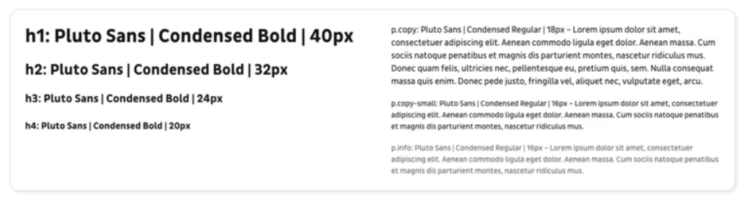
Every font looks slightly different, so it’s difficult to give a definitive answer about minimum font size. Laura Heine recommends that “body text should not be any smaller than 16px to be easily readable. If you have a website with long articles it’s better to go with something around 18px up to 20px to make reading longer passages enjoyable for the user.” Often it is useful to have a second style for body text that is either a bit smaller or a bit bigger than your main body text. It can be used for article leads, teaser texts, or information boxes.
Best practice for heading sizes is to scale them relative to body text size, to create a clear visual distinction between different levels of headings and the body text. Use a predictable scale—but there is no hard and fast rule. Start by picking a base size then increase consistently by a ratio like 1.125 or 1.333. Adobe fonts use a ratio of 1.125, and IBM created their own scale built on a single equation.
When it comes to informational text like captions, footnotes, or fine print, it’s important to strike a balance between legibility and conserving space. The font size for smaller text should consider the surrounding context and any visual elements or constraints. Info text like copyright under an image, or explanatory text in a form can be quite small but should definitely not be smaller than 12px for it to be legible.
Establishing a Typographic Hierarchy
Hierarchies are very important in any kind of information design. They allow the reader to quickly scan to find relevant content and make website content easily digestible. Typography is a wonderful tool to create these hierarchies in a simple and effective way—but to keep the look of the website consistent we don’t want too many different text styles.
The NNGroup says three font sizes is enough to get you started. Small, medium, and large provide enough variety to work with but still keep hierarchical relationships well defined and clear. Creative Designer Dan Mall cautions that many designs need more than three options (in clothing, the conventional sizes of S, M, and L are not sufficient for inclusivity and variation). He devised a simple numerical system to make seven typographic styles with a guessable scale that is somewhat future-proof.
Laura Heine agrees that seven seems to be a good place to start. She says, “Usually it is enough to define four different headings, body text in two sizes and maybe an infotext element. This gives you around seven different font sizes which is a good base to start from.” During the design process it’s common that you’ll encounter some exceptions or maybe need to add another heading, but just keep in mind that less is more.
Laura explains how the UX Design team at b13 uses size to create hierarchy within the UI. “Using the size of the body text as a basis, we define four headline styles. The biggest for titles and impactful headlines can be quite dramatic. For the other three, we fill up the scale between the body text and the largest headline. Always look at your font sizes in context, combine different headings with body text and see what looks good together. Also think about the context. A level three headline will most likely be used in close proximity to body text so you want to make sure it doesn’t disrupt your reader’s flow.”
Note that when you consider font sizes, you’ll always have to consider line height too. As a rule of thumb, aim for 1.2x the font size for headlines, and 1.5x the font size for body text. This way the line height is large enough for the reader to easily skip from one line to another, and at the same time small enough to still let a text block look like an actual block.
Best Practices for Font Weight and Color
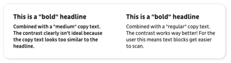
Size is not the only element when making choices about text in your design. You’ll also want to consider font weight and color. Be mindful that you’re aiming for visual consistency and a cohesive design language, so if you use too many font weights or a mix of colors, the resulting design can be cluttered and overwhelming. Used judiciously, a font weights and colors can carry the visual hierarchy, ensure user comprehension, and improve readability.
Use font weight to enhance contrast between headings and body text
Font weight can help to add more impact to your headings and make it easier to distinguish between smaller headings and body text. When designing for the web it’s best not to go for thin or hairline font weights. They might look fine on your high-quality screen but they can be very hard to read on older devices or for people who are visually impaired. To ensure a nice contrast between the hierarchies, use font weights that are not too similar. Try also not to use more than three font weights so that you can keep your website’s look consistent.
Use font color to complement and support hierarchy
Color can be an additional way to communicate hierarchies but it should never be the only way to communicate information, so make sure to combine it with size or font weight. If you want to find out more about the use of color in UI design, read our article on UI Design Basics: Colour.
Implementing Font Size Guidelines in UI Design
Ensuring readability and accessibility for diverse users
Don’t be tempted to opt for style over substance—keep readability in mind when choosing a font. Handwritten or brushed fonts can look great for accents, but are really hard to read for longer blocks of text. Choose typefaces with distinct characters (that pass the I-L-1 test) to help users easily differentiate information seen at a glance.
Taking stock of your existing fonts
If you’re not starting from scratch, it’s good practice to conduct an audit of your existing fonts. A tool like CSSstats.com can quickly show you how many unique font sizes and font-family stacks you currently have in use. From here, you can then search your code base and see how certain font sizes are being used by mapping them to a specific category. You may find that many of your font sizes don’t see much use—a great opportunity to declutter and retire some font sizes!
Testing paragraph styles with real or dummy content
Once you have different paragraph styles defined, you need to put them to use on an actual website layout. This lets you check how they will work in the broader context of the site, and how they work in relation to each other. When trying out your styles, it is always best to use real content if you have it. If not, use dummy content in the intended language of the website. Try to have a mix of different word counts and sentence lengths to really test out your styles in a number of different contexts. Sometimes an artificially text-heavy UI is what you need to reveal how a font will perform.
UI typography should work reasonably well in most, if not all, situations. The only way to understand if your chosen typeface has these qualities is to use or simulate use in the real world. This type of testing is extremely useful because it allows us to judge the typeface by its merits in the UI. AirBnB tested their new font, Cereal, extensively. They spent six months testing 30 different iterations of the font for style and weight. Once they’d settled on the overall style, they spent a further six months putting the font through its paces in the UI.
Considerations for text layout, line length, and spacing
For languages that read from left to right, always use left-aligned text to achieve the highest possible readability. Use centered text judiciously. It can look nice as an accent, but the ragged starting edges make it harder for your eye to track from one line to the next. Try to stay away from justified text. Fully justified text can look good in print where you can adapt every paragraph manually, but on the web this is bound to lead to awkward spaces in your lines.
Another thing to keep in mind is the actual width of your text lines. Laura Heine explains: “Have you ever tried to read a long article on a website that uses the full width of the window for the text? This is going to be very tiring for any reader.” Best practice for readable content is to limit the line length to about 70 to 80 characters. This is especially important if you have longer pieces of content on your website like blog articles.
Spacing can be a tricky business. The most important thing when looking at spacing between typographic elements is to group elements that belong together. This makes it easier for the reader to scan and comprehend content blocks. It might sound simple but it has a big impact.
Responsive Design and Font Size Adaptation
You want your carefully chosen fonts to adjust gracefully to different devices, so that content adapts seamlessly to various screen sizes without compromising legibility. That means knowing your way around a style sheet. This decades-old article from NNGroup about the effective use of cascading style sheets (CSS) still holds true today.
Use relative units instead of fixed pixel values. Relative units, such as percentages and ems, allow font sizes to scale proportionally based on the parent element or the browser’s default settings. You can also use media queries to fine-tune font sizes for specific breakpoints to control the experience for users across various devices.
Techniques for maintaining readability across devices
- Accessibility: Users with visual impairments might require larger font sizes to read comfortably. The Web Content Accessibility Guidelines (WCAG 2.1) guidelines stipulate that text should be able to be resized up to 200% without loss of content or functionality.
- Set the viewport meta tag: The viewport is the visible area on a user’s screen. Set the viewport meta tag so the browser can adjust the content’s dimensions to fit the screen. This eliminates the need for users to zoom in or out to read the text on different devices.
- Keep line length to a minimum: Avoid excessively long lines of text which would require users to scroll horizontally. A general guideline is to keep lines between 45–75 characters, including spaces.
- Design for your use case: Understand how your users are going to interact with your design, and choose font sizes that are comfortable to read in that context. Be aware of the viewing distance.
- Conduct user testing: Test your font sizes across different devices and screen resolutions. Emulate real-world scenarios by viewing your interface on various smartphones, tablets, and desktop monitors.
Revitalizing Your Typography: A Key to Captivating Web Designs
Well-executed typography is the basis of a stunning web design, allowing you to showcase your content in a readable and attractive way, and increasing the chances of users reading and understanding your content.
It’s never too late to review and update your UI designs with a critical eye on your font choices. Do they still serve your brand and effectively convey your company’s style? If you feel like the typographic system of your website has grown out of control over the years, contact b13 and we’ll find a solution together.
Want to improve your website’s user experience? Our User Experience Services can help you optimize your typography and overall design.
Frequently Asked Questions
What is the ideal font size for UI design?
There is no official minimum font size, but body text of around 16 pixels is a good place to start. Size for other elements, like headers and information text, should scale relative to the body size. Consider readability, hierarchy, context and responsive design.
How many font styles should be used in a UI design?
Limiting the font styles to a primary font, a heading font, and a few accent fonts helps maintain visual harmony while providing sufficient variation for different UI elements.
How can I ensure my UI design is accessible to all users?
Make your UI design inclusive and accessible with the following practices:
- Use appropriate color contrast for readability.
- Provide descriptive alternative text for images.
- Implement a hierarchical heading structure.
- Ensure keyboard accessibility for all interactive elements.
- Use descriptive link text to convey the purpose of links.
- Design for scalability and responsiveness across different devices.
- Conduct user testing with individuals of diverse abilities.
How do I adapt font sizes for different devices and screen resolutions?
Use relative units like percentages, ems, or rems instead of fixed pixel values. This way, fonts automatically scale based on the user’s device or screen size. Test on various devices and resolutions to ensure legibility and readability across different screens.