
UI Design Basics: Colors

Colors are an integral part of a business‘ branding, but often chosen primarily for print use. Colors that work perfectly on paper can be inaccessible on displays. This is how we create color palettes that work on-screen, are consistent with corporate branding, and are accessible for all users.
Most often our clients have done wonderful work on their corporate design (CD) before we get on board to start with the webdesign so we get a predefined set of colors to represent the brand. However, those colors are often chosen primarily for print use. And while they might work perfectly on paper, they can be inaccessible on displays. Colors for web design have to meet different requirements than colors for print. Also, to design an entire website with different hierarchies and content types, we might need more shades than originally defined to structure the website and display system alerts.
So before we get started with a new design for a client website, we need to analyze the existing colors, consider how they can be used, where the color scheme has to be extended, and check for accessibility. To do this, we separate the colors used on a website into three categories:
- Brand colors: colors that represent the brand and should be used throughout the entire website but still sparingly enough to be meaningful
- UI colors: colors and shades that are used to structure content types and create hierarchies
- Feedback colors: Colors to display system feedback, like errors or notifications
Working with brand colors while ensuring accessibility
Brand colors are a—if not the—key element in any corporate identity. Therefore they should definitely be handled with care and it’s best not to change them. The first thing we assess is how they can be used. We like to use them as calls to action, like buttons and links, but the question is, are they accessible? Used as buttons or links we make sure the brand colors reappears throughout the entire website and strengthens the branding. But in order to use a brand color like that, we have to check if it can be used for text and is still readable.
There are great tools out there that check this for you. We use the Stark plugin for Adobe XD and the tanaguru contrast finder for web. For example, let’s say one of your brand colors is a slightly softened red. We feed this color to the contrast checker and use white as a background color. The result will be something like this:
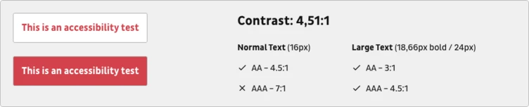
What might seem confusing at the beginning is actually quite easy: The color combination works for large text and normal text, if you go for the AA Standard.
The standards are defined by W3C in their Web Content Accessibility Guidelines. Basically there are three Levels: A, AA and AAA.
Side Note
A is mandatory but still excludes a lot of people; AA should always be attained, as it removes significant barriers. AAA is the highest goal and removes further difficulties in accessing the website.
Which standard you should go for depends on your audience and brand requirements but you should definitely always aim for at least the AA level to include a wider audience and also to reach Google’s requirements
Now what looks good for white and red might look different for dark grey and red. If you primarily use two background colors on your website you need to make sure your color works on both.
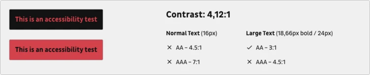
You see, we didn’t adhere to the requirements here and therefore had to make adjustments. That’s why you’ll notice that on b13.com our textlinks are red on a white background but yellow (a secondary brand color) on dark grey.
We were able to switch to a different brand color here. If you need to make adjustments to the brand color in order to make it work, always make sure to check in with the responsible design team.
Throughout the project, remember to check the color against different background colors and don’t forget to check hover colors, too.
Choosing suitable UI colors to structure content
To structure content on the website we will most definitely need a number of color shades to distinguish between elements and content areas. Sometimes the CD already delivers some shades, other times there’s only one neutral color for text included.
Most often, the supporting shades are variations of a grey tone, maybe tinted with the brand color or a contrast color. We like to have enough shades to distinguish elements but also keep it limited to avoid too many different colors that would look the same to the user anyway.
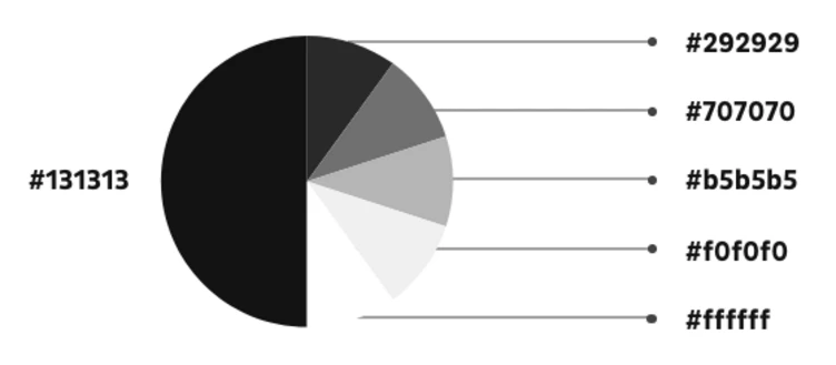
Usually we have a dark shade already defined to be used as text color so we start with this. In addition we will need a slightly lighter grey that’s still readable on white (here comes the contrast check again) and can be used to display secondary text or for element borders. Then we’ll add a lighter gray to display inactive elements and an even lighter grey for backgrounds.
For every grey make sure to check whether you have to use light or dark copy text on it. In the end we might have a range of greys like this:
During the design process this palette can of course change, but we try to keep it simple and expressive.
Don’t overlook feedback colors
Functional colors to display feedback might well be the most unloved stepchild of UI design. Red and green might not go with your color scheme at all but there will most likely be a point where you need to convey error messages or other feedback. The least you can do is to fit them into the grander color scheme and make sure they are readable. Even if you don’t have a need for them in the beginning it’s better to have them defined than to see your design come to life later and realise that default #ff0000 is used for error messages. We always define a red for error messages and if we are really thorough we also select a green for success messages, yellow for alerts and some subtle color for notifications.
After these steps we have derived a great color scheme from the brand colors that can be the basis of our UI design. Those colors don’t have to be final but they are a good starting point. They are on brand, accessible, and can support a great website.