Best Practices and Usability for Online Forms

Forms are one of the most common ways to interact with a website, for example signing up for a newsletter, completing a check-out process, contacting a company, or creating an account. It’s important to get the design right.
The first thing users do when they see a form is to estimate how much time it will take to complete. They do this by scanning the form. The more complex a form appears, the more likely users are to abandon the process. The key is to make the process as seamless and simple as possible without negatively impacting the user experience.
There are several well-established (but often ignored) guidelines to designing great forms. The Nielsen Norman Group talks about them in their article Website Forms Usability: Top 10 Recommendations.
Here we present a deep dive into the best practice usability guidelines for designing online forms, so that users stay on task and have a delightful interaction with your website.
Talk to our Design team to find out more.
Labels
Label and labelling of input fields
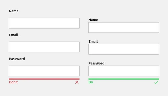
The design principle of proximity states that related elements should be placed close to each other. This Nielson Norman Group article about form design and white space explains that when a label is placed close to the corresponding input field, the eye can easily recognise which label belongs to which input field.
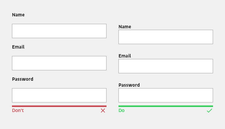
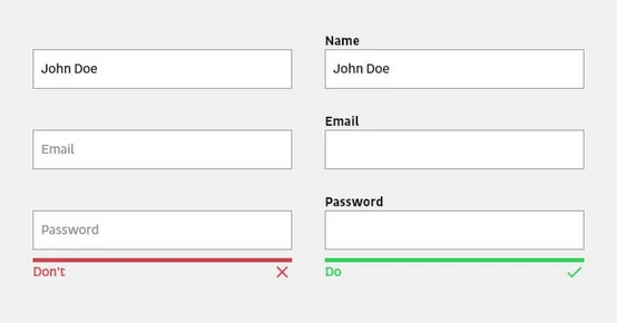
The label should always be placed outside an input field so that users do not lose the context when answering an input field. For mobile and smaller forms, the label should be placed above the input field; for long desktop forms, it should be placed next to it.

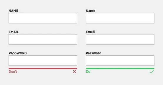
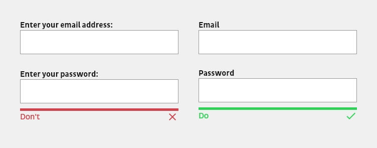
Avoid capital letters in labels. They are harder to read and so make it harder to complete the form.

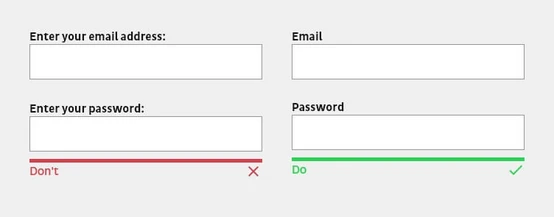
The name of a label should be clearly understandable and in simple language to make the form easily accessible and to avoid mistakes. Labels should explain at first glance what information is needed. If technical terms are unavoidable, always include explanatory text to help.
Labels themselves do not serve as explanatory or help texts. They should always be kept concise and short with one or two words so that the form can be grasped quickly and easily.
Placeholder as an extension of the labeling

Placeholders should never be used instead of a label, because the context is lost for the user when filling in the input field. Placeholders in some cases are a supportive way to provide further explanations or hints. However, this additional support disappears when the data is entered. If the user forgets the hint while entering the data, they are forced to delete the entry in order to see the information again. Nielsen Norman Group explains more in the article Placeholders in Form Fields Are Harmful.

Note texts to explain input or formatting requirements.
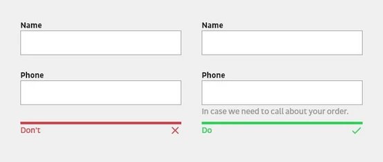
A hint text, like the label, should be placed in close proximity to the associated input field. This text is used to explain specific terms or why certain information is needed. Likewise, expected formatting for an input field can be displayed or explained in more detail.

Use Input Masks.
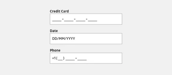
Input masks are not just placeholders, but format the data provided by the user to a desired format. Brackets, spaces, and hyphens are automatically displayed in the input field when a phone number is entered, for example. Masked input not only prevents errors caused by incorrect formatting, but also makes it easier for users to verify the data they have entered.

Note
Be mindful of your audience. Labelings, placeholders, masks etc. may differ between countries and regions.
Input fields
Input fields should look like input fields.

Creative or innovative ideas in the design of input fields can lead to a negative user experience if users no longer know or understand that they can interact with the field. Therefore, input fields should be recognizable as such and look as users would expect.

Highlight the active input field.
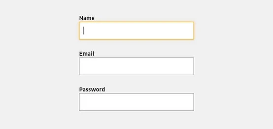
The first field of a form should be automatically highlighted when the user wants to fill in the form. This not only gives them a clue on where to start, but also saves them from typing or clicking. The focused field should be visually highlighted so that users can immediately see where they are.
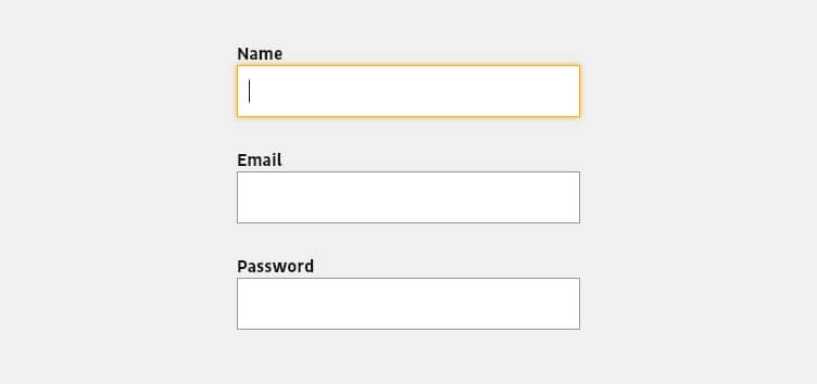
Input fields should be accessible via tab.
Some users use the tab key to jump to the next input field. The form should be tested to see if the tab key navigates to the input fields in the correct order. Note also that the input fields themselves should be arranged logically as well, and that when a value is selected, the most frequently used options should be at the top.
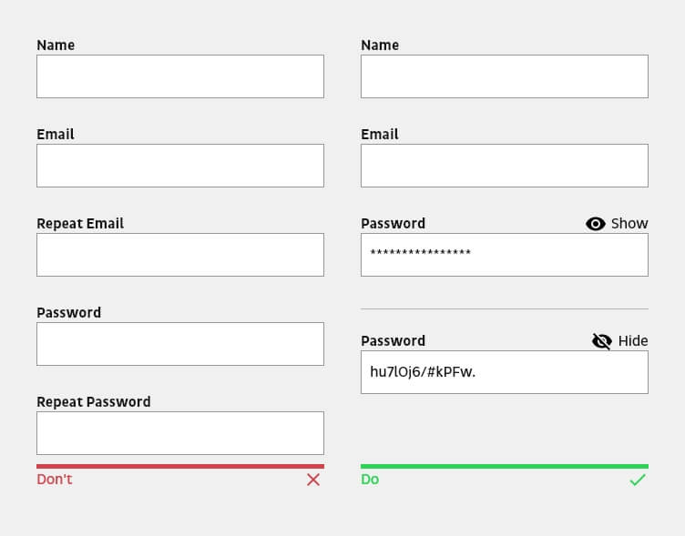
Avoid confirming the email address or password.
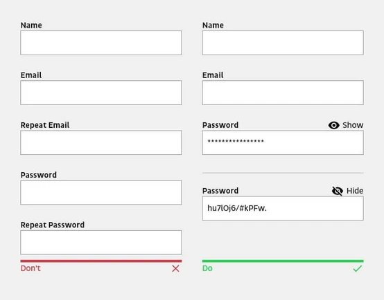
If e-mail address or password fields are used in a form, refrain from making users repeat the input. The purpose of entering the data twice is to ensure that the data has been entered correctly. However, users often copy and paste the same content into the corresponding field. If this function is blocked, however, the risk is slightly increased that users will make one or more mistakes and, in the case of a password, not even see the error. It is better to give the possibility to display the password, for example. Unmasking the password and PIN helps to avoid logon errors.
Size of the input fields should correspond to the content.
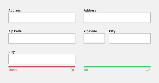
Input fields should reflect the expected content in their size. While an input field for an e-mail address, for example, can contain 40 characters, a postal code requires just five. Users perceive the size of an input field as an indication of the amount of text they need.

Do not separate input fields into subfields.

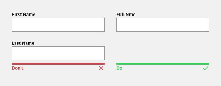
Input fields such as name, phone number, or date of birth should not be divided into multiple input fields. Subdividing them forces users to type or click extra times to move to the next field and may also require more precise validation, which can have a negative impact on the form process. The better solution is to show the formatting guidelines using placeholders, help texts or masks.
Provide appropriate keyboard.
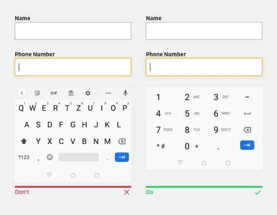
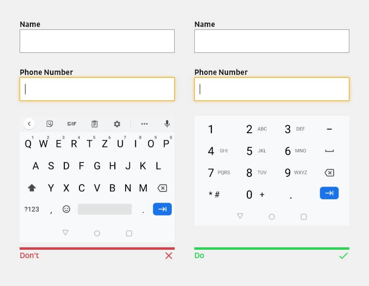
For mobile users, the appropriate keyboards should be made available or the input field should be provided with the appropriate input type. This prevents them from having to perform additional actions. For example, show the number keypad for phone number fields.
Avoid dropdown elements if possible.
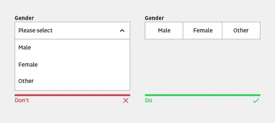
A dropdown hides the choices and requires two clicks to select the desired option. Use a dropdown element only when the selection offers more than five options or when space is too limited, and include a search option when the selection significantly exceeds 20 items. Otherwise, provide the options as radio or check boxes so that only a single tap or click is required.
CTA button
Avoid buttons that reset the form or delete input.
The risk of involuntarily deleting entries made so far outweighs the unlikely event of wanting to start the form from scratch. The frustration of accidentally resetting a form will almost certainly result in users not filling out the form again.
Buttons with a call to action should be descriptive.
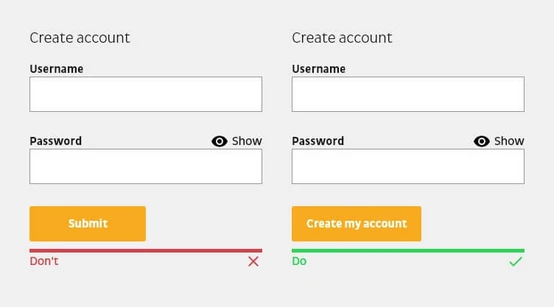
Avoid unclear prompts such as “Submit” or “Request”. The label of a button should always explain what the button does or what users will achieve by filling out the form. One way to describe the action is to end the sentence with “I want to…”. For example, if users want to create a customer account, the wording of the call to action could be “Create my customer account”.
Disable button after sending.
Processing a form usually takes some time. Therefore, it is important to provide feedback not only when the action is complete, but also when a button has been pressed. Disabling the button not only prevents accidental resubmission, but also informs the user that the system has received their submission.
Design primary and secondary buttons differently.
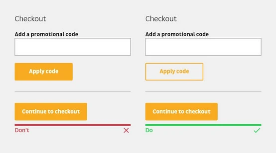
If possible, secondary buttons should be avoided. However, if the form contains more than one button, each button should be visually weighted differently. The primary button should be more prominent than the secondary. Likewise, there should be enough spacing between each button so that the wrong button is not clicked accidentally.

Error message & validation
A digital product should always be designed and developed in such a way that it is error-friendly. That is, in the optimal case, no errors occur. This is only the case if the digital product reacts as flexibly as possible to the user’s input.
More information about error handling can be found in our article “Best practices and usability for error messages and feedback systems”.
The form and its structure
Keep it simple.
Most users scan a website instead of reading it. The same applies to filling out forms. For this reason, forms should be kept as simple as possible in terms of their structure. This makes it easier to fill out a form quickly and easily.
Only request relevant information or remove all fields that can be derived at a later time or that can be omitted. Minimize the number of related input fields either by structuring them into semantic groups, splitting them into several steps (multi-step form) or by progressively revealing more input fields.
Arrangement of input fields from easy to hard.
Always prioritize the form’s input fields from easy to hard, and only ask complex or personal questions towards the end. If users encounter a question they can’t answer at the beginning (for example, if they don’t have their credit card information), they’re more likely to abandon the process than if they’re asked to answer it later because they’ve already invested effort and feel compelled to complete the form.
Use single-column layout.
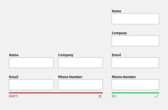
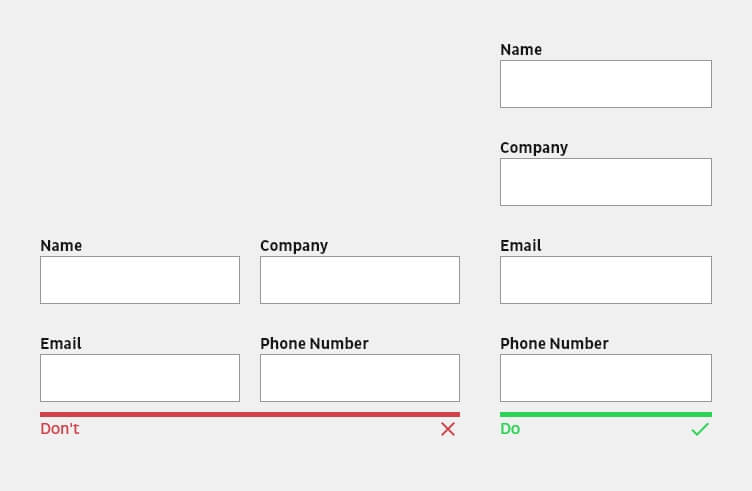
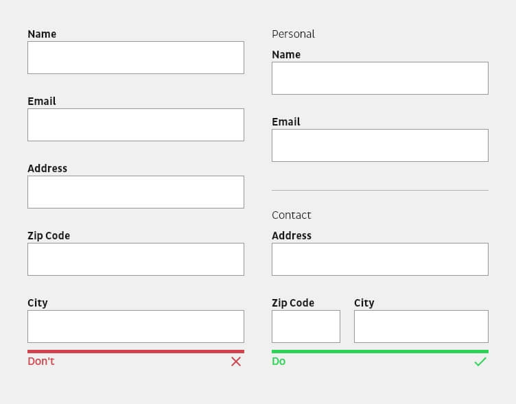
Single-column forms are processed more easily from a cognitive point of view because multiple columns interrupt the vertical flow of the downward movement of the form. With multiple columns, the eyes zigzag back and forth, which significantly slows down the process and perception. Exceptions here are short and logically related input fields, such as city, state, and zip code, or date and time, which can be displayed in the same line.
Structuring a complex form into semantic groups.
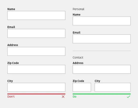
The design principle of proximity is not only used for the label to the input field, but also for input fields that logically belong to each other. More complex forms in particular should have a visual separation or section headings that divide input fields into semantic groups.
Note the size of the input fields and buttons.
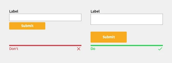
Especially for mobile devices, attention should be paid to the minimum size of input fields and buttons, as too small/narrow elements can make operation more difficult and unnecessarily frustrate users . The area to be selected for touch should be at least 48x48px and for click 46x46px. Furthermore, click and touch areas should have at least 8px distance to each other.

Be careful with predefined input values.
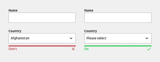
Predefined input values can be used to minimize the effort of filling out a form. However, predefined input values only make sense if you can be sure that more than 95% of the users would choose this value—especially if this value is needed. Users usually skip pre-filled input fields and do not check their value anymore.
Use smart default settings.
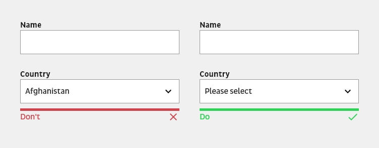
However, the rule for predefined input values does not apply to smart defaults, which are preset values based on available information from the user. Smart defaults can not only speed up the form filling process, but also reduce possible input errors. Nevertheless, users should be asked in advance whether they want to fill in the form with the preset values.
Auto-fill functions of the browser.
Some browsers have the function to automatically fill forms with just one click. Therefore, each input field should be provided with a term that the browser can recognize and fill in order to simplify and accelerate the form process for the user. This includes, for example, first name, last name or e-mail, but also credit card information.
Use autocomplete when possible.
When entering data, be mindful of the user effort required. Typing is not only time-consuming, but also error-prone—especially on mobile devices. Provide users with a list of suggestions based on the content of the input field. For example, GoogleMaps can be used to complete the address as it is typed.
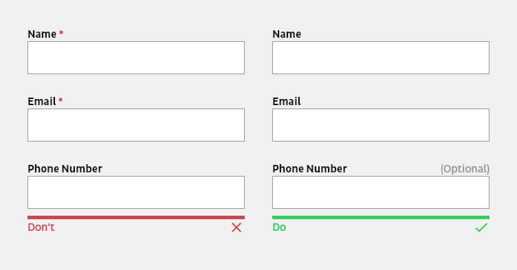
Distinguish between required and optional input fields, instead of mandatory fields.

Generally, the majority of input fields in a form are mandatory. Therefore, only the input fields that are actually optional should be marked with “Optional”. Since the general rule is to ask only for necessary information, the number of optional input fields should be close to zero or limited to one or two.
Inform the users about the state of success.
It is not enough to simply submit the form and reload the view if necessary. It is important that users are notified that they have successfully completed the form. The notification can be communicated via a simple check mark. Even better is an information text that provides additional information. For example, when users can expect a response to a contact request.
Handling sensitive data.
People are increasingly sensitive about their privacy and security. Most users will hesitate when it comes to disclosing information that is too private or too sensitive. To avoid unnecessary doubts or questions, explain why certain data is needed and requested with the help of a notice. Avoid asking for unnecessary or confidential information.
Avoid links to other sites.
Avoid links that take users away from the form and to another page. The form process should not be interrupted by users suddenly finding themselves on another page and, in the worst case, even forgetting that they were in the process of filling out the form. Use links only when it is really necessary to explain something to users via an official source.
Multi-step forms
Use of a significant progress indicator.

Users should always be clearly informed about the total number of steps in the form, which step they are currently in, which steps are still ahead of them, and which steps have already been completed. Particularly in the case of more complex forms, the uncertainty of the process status can lead to users abandoning the process prematurely.

Real-time feedback of buttons for the next step.
The button for the next step should only be activated when the user has filled in all the required input fields in the current step. The visual activation of the button allows the user’s focus to jump to the right place at the right time. It is important to note that the display between the deactivated and activated state is visually explicit.
Accessibility
It should always be possible for all users to access and use a digital product equally. Accessibility is not only beneficial for people with disabilities, it also contributes to a better user experience for all end users.
Summary
If you’ve read this far, you’re as interested in creating delightful web experiences as we are! The Design Team at b13 are passionate about UX best practices and we’re experts at what we do.
Contact us to talk more about usability and design, or if you’d like help improving the forms on your site.
