
Best Practices for Effective Web Forms

Web forms are the linchpin that connects users to your digital services, acting as the essential interface where information exchange happens. Whether it’s a simple contact form, an intricate sign-up process, or an extensive application form, the efficiency and usability of online forms can greatly impact user engagement and conversions. Poorly designed forms can lead to a high drop-off rate, user frustration, and loss of potential customers.
At b13, we specialize in user experience (UX) and user interface (UI) design, so we understand the critical role of web forms. In this article, we delve into the world of web form design, covering key elements of effective forms, advanced design techniques, best practices for mobile forms, and the importance of form security and data privacy. We’ll also discuss strategies for measuring and improving form performance.
If you’re serious about enhancing your digital interfaces, driving higher engagement, and maximizing conversions, read on—and consider getting in touch with our expert team at b13 today.
- Introduction: The Critical Role of Web Forms in User Engagement and Conversion
- Key Elements of Effective Web Forms
- Advanced Form Design Techniques
- Best Practices for Mobile Form Design
- Importance of Form Security and Data Privacy
- Strategies for Measuring and Improving Form Performance
- Conclusion: The Ongoing Journey to Optimize Web Form Design
- FAQs
Introduction: The Critical Role of Web Forms in User Engagement and Conversion
Web forms are an integral part of the digital user experience. They are the interactive gateways that allow users to engage with online services—be it through placing an order, requesting information, or signing up for a subscription. The design and usability of these forms can significantly impact the user’s experience and, consequently, the rate of user engagement and conversions.
Importance of Form Design and User Experience
A well-designed form is like a conversation, guiding the user through each step in a simple, intuitive manner. This involves more than just arranging fields and buttons. It requires a deep understanding of the user’s journey, needs, and expectations.
Back when Stefanie Braun was a front-end developer at b13, she said: “The first thing users do when they see a form is to estimate how much time it will take to complete. They do this by scanning the form. The more complex a form appears, the more likely users are to abandon the process. The key is to make the process as seamless and simple as possible without negatively impacting the user experience.”
Remember, forms aren’t just a means of gathering information—they are also a representation of your commitment to your customers. A well-designed form sends the message that you value the user’s time and effort, which can significantly contribute to building trust and loyalty.
Key Elements of Effective Web Forms
The most basic elements of form design are the labels and types of field you use, combined with how you arrange these on the page and how you provide feedback to your users. Let’s consider these factors in more detail.
Clear and Concise Form Labels
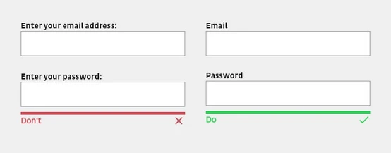
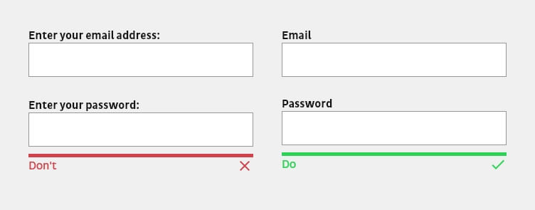
A form label should be as concise as possible and describe as precisely as possible what is expected from the user. Stefanie Braun advises: “Labels should explain at first glance what information is needed. If technical terms are unavoidable, always include explanatory text to help.”
Note that labels themselves do not serve as explanatory or help texts. They should always be kept concise and short with one or two words so that the form can be grasped quickly.
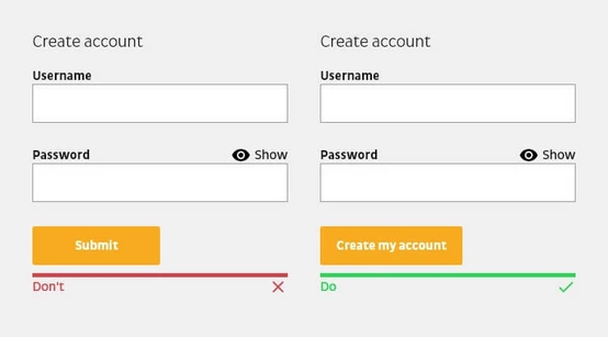
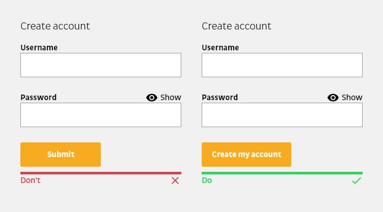
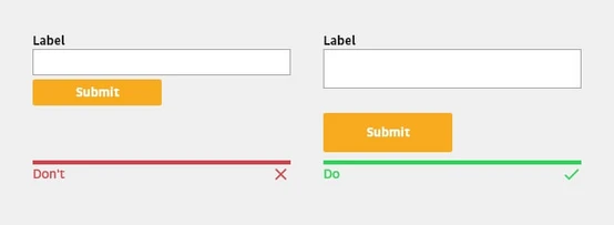
Similarly, buttons with a call to action should be descriptive. Avoid unclear prompts such as “Submit” or “Request”. The label of a button should always explain what the button does or what users will achieve by filling out the form. One way to describe the action is to start the sentence with “I want to…”. For example, if users want to create a customer account, the wording of the call to action could be “Create my customer account”.
Make Input Fields Easy to Navigate

Just as your labels should be crystal clear, so should your input fields. Creative or innovative ideas in the design of input fields can lead to a negative user experience if users no longer know or understand that they can interact with the field. Therefore, input fields should be recognizable as such and look as users would expect.
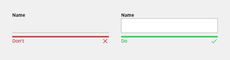
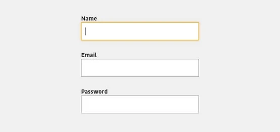
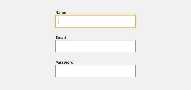
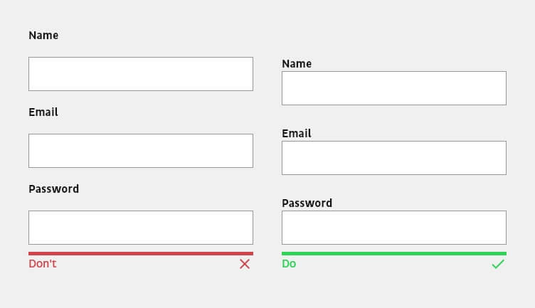
You should also always highlight the active input field. The first field of a form should be automatically highlighted when the user wants to fill in the form. This not only gives them a clue on where to start, but also saves them from typing or clicking. The focused field should be visually highlighted so that users can immediately see where they are.
Finally, don’t forget that input fields should be accessible via the keyboard. Some users use the tab key to jump to the next input field. The form should be tested to see if the tab key navigates to the input fields in the correct order. Note also that the input fields themselves should be arranged logically as well, and that when a value is selected, the most frequently used options should be at the top.
Appropriate Form Field Types
Field types should correlate to the kind of data you expect to collect. For instance, don’t use a text field when you’re expecting a date—use a date picker. This not only prevents user errors but also speeds up the process of filling out a form. This is especially important for mobile devices, where types like ‘tel’, ‘email’ or ‘number’ ensure the correct keyboard is displayed.
Appropriate Placement and Arrangement of Form Fields
Most users scan a website instead of reading it. The same applies to filling out forms. For this reason, forms should be kept as simple as possible in terms of their structure. This makes it easier to fill out a form quickly.
Here are the main guidelines for arranging your fields:
- Always prioritize the form’s input fields from easy to hard. Only ask complex or personal questions towards the end. If users encounter a question they can’t answer at the beginning (for example, if they don’t have their credit card information), they’re more likely to abandon the process than if they’re asked to answer it later because they’ve already invested effort and feel compelled to complete the form.
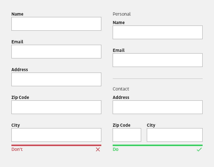
- Only request relevant information and minimize the number of related input fields either by structuring them into semantic groups, splitting them into several steps (multi-step form) or by progressively revealing more input fields.
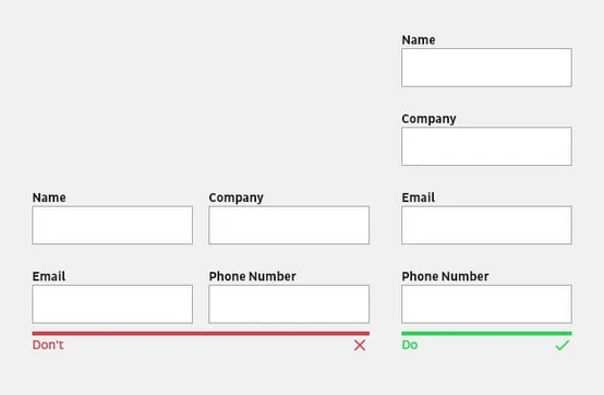
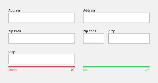
- Single-column forms are processed more easily from a cognitive point of view because multiple columns interrupt the vertical flow of the downward movement of the form. With multiple columns, the eyes zigzag back and forth, which significantly slows down the process and perception. Exceptions here are short and logically related input fields, such as city, state, and zip code, or date and time, which can be displayed in the same line.
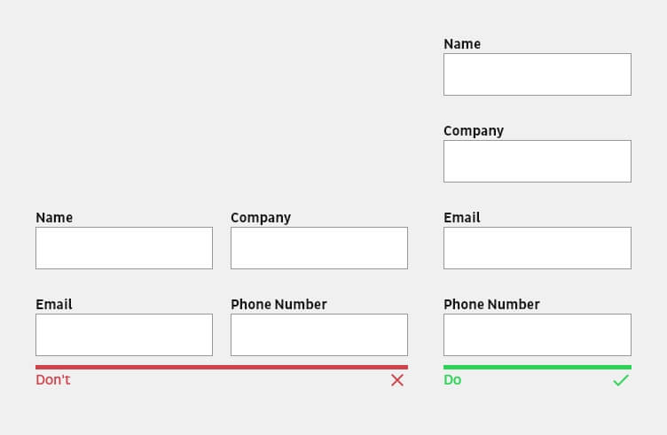
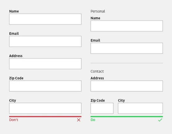
Structure a complex form around semantic groups. The design principle of proximity states that related elements should be placed close to each other. More complex forms in particular should have a visual separation or section headings that divide input fields into semantic groups.
Feedback Mechanisms (e.g. Error Messages) and Multi-Step Forms

Feedback mechanisms are important to ensure users can successfully complete your forms. This means showing users when things have worked out well, and when there may be problems. Multi-step forms are a more elaborate way of providing feedback.
Here are some key principles to bear in mind:
- Inform users about the state of success
It is not enough to simply submit the form and reload the view if necessary. It is important that users are notified that they have successfully completed the form. The notification can be communicated via a simple check mark. Even better is a message that provides additional information. For example, when users can expect a response to a contact request. - Deactivate buttons after sending
Processing a form usually takes some time. It is important to provide feedback not only when the action is complete, but also when a button has been pressed. Deactivating the button not only prevents accidental resubmission, but also informs the user that the system has received their submission. - Real-time feedback of buttons for the next step
The button for the next step should only be activated when the user has filled in all the required input fields in the current step. The visual activation of the button allows the user’s focus to jump to the right place at the right time. It is important to note that the display between the deactivated and activated state is visually explicit. - Error messages
A digital product should always be designed and developed in such a way that it is error-friendly. Thoughtfully designed error messages can help guide users through successful form completion, leading to better user engagement and conversion rates. More information about error handling can be found in our article on best practices and usability for error messages and feedback systems. - Multi-step forms should use a significant progress indicator
When using a multi-step form, users should always be clearly informed about the total number of steps in the form, which step they are currently in, which steps are still ahead of them, and which steps have already been completed. Particularly in the case of more complex forms, the uncertainty of the process status can lead to users abandoning the process prematurely.

Advanced Form Design Techniques
Once you understand the basics, there are some additional form design techniques that can make your designs even more effective. In this section, we delve into several of them, including the use of input masks, note texts, appropriate field sizing and arrangement, as well as the proper usage of dropdown elements.
The Use of Input Masks in Form Design
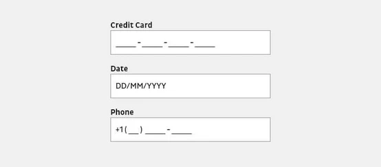
Input masks are a powerful tool in form design, assisting users to input data in the correct format. Input masks are not just placeholders, but format the data provided by the user in the manner required by your backend system. Brackets, spaces, and hyphens are automatically displayed in the input field when a phone number is entered, for example. Masked input not only prevents errors caused by incorrect formatting, but also makes it easier for users to verify the data they have entered.
You should note, however, that required formats may differ between countries and regions.

The Role of Note Texts in Form Design
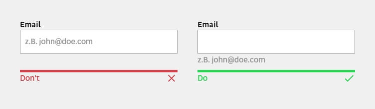
Note texts can provide clarity, prevent errors, and guide the user to enter information correctly. A hint text, like the label, should be placed in close proximity to the associated input field. This text is used to explain specific terms or why certain information is needed. Likewise, expected formatting for an input field can be displayed or explained in more detail.

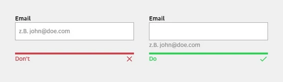
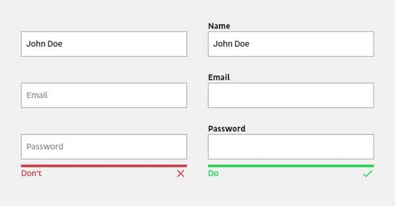
Placeholders should never be used instead of a label or hint, because the context is lost for the user when filling in the input field. Placeholders in some cases are a supportive way to provide further explanations or hints. However, this additional support disappears when the data is entered. If the user forgets the hint while entering the data, they are forced to delete the entry in order to see the information again. Nielsen Norman Group explains more in the article Placeholders in Form Fields Are Harmful.
The Importance of Input Field Size and Arrangement
Field size and arrangement play a crucial role in form design. The design principle of proximity states that related elements should be placed close to each other. This Nielsen Norman Group article about form design and white space explains that when a label is placed close to the corresponding input field, the eye can easily recognize which label belongs to which input field.
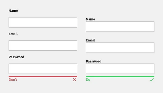
The label should always be placed outside an input field so that users do not lose the context when answering an input field. For mobile and smaller forms, the label should be placed above the input field; for long desktop forms, it should be placed next to it.

Finally, the size of input fields should reflect the expected content. While an input field for an e-mail address, for example, can contain 40 characters, a postal code requires just five. Users perceive the size of an input field as an indication of the amount of text they need.

The Dangers of Separating Input Fields into Subfields

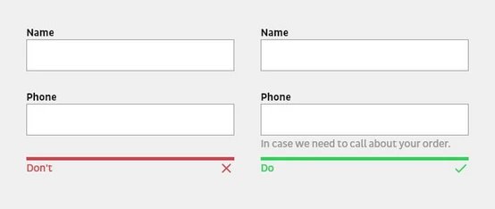
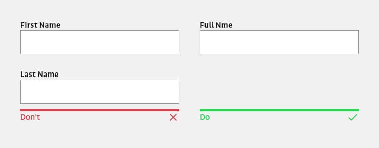
While it might seem intuitive to break up data into smaller input fields for ease of entry, this can slow down users. Input fields such as name, phone number, or date of birth should not be divided into multiple input fields. Subdividing them forces users to type or click extra times to move to the next field and may also require more precise validation, which can have a negative impact on the form process. The better solution is to show the formatting guidelines using placeholders, help texts or masks.
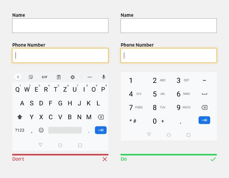
The Power of Providing Appropriate Keyboards for Mobile Users
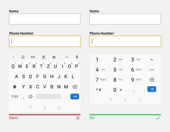
For mobile users, the appropriate keyboards should be made available or the input field should be provided with the appropriate input type. This prevents them from having to perform additional actions. For example, show the number keypad for phone number fields.
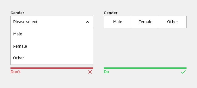
The Pros and Cons of Dropdown Elements in Form Design
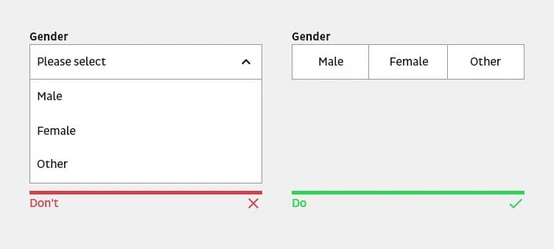
Dropdown elements can be beneficial in certain contexts, such as when many available options aren’t all known to the users. However, you should avoid dropdown elements wherever possible. A dropdown hides the choices and requires two clicks to select the desired option. Use a dropdown element only when the selection offers more than five options or when space is too limited, and include a search option when the selection significantly exceeds 20 items. Otherwise, provide the options as radio or check boxes so that only a single tap or click is required.
Best Practices for Mobile Form Design
Designing forms for mobile devices requires a unique set of considerations. Users interact differently with mobile devices compared to desktops, primarily due to the touch interface and smaller screen size. As such, form design must adapt to these constraints to maintain a positive user experience.
Responsive Design Considerations
Responsive design is a must in the current era of varied screen sizes. A form designed with responsiveness in mind adapts to the screen size of the device it’s viewed on. This means that no matter whether a user is accessing your form from a small smartphone, a larger tablet, or a desktop computer, the form will adjust to fit the screen perfectly.
Touch-Friendly Input Fields and Buttons
With mobile devices, users interact directly with the screen. Therefore, input fields and buttons must be large enough to be easily tapped without accidentally selecting the wrong element. The area to be selected for touch should be at least 48x48px and for click 46x46px. Furthermore, click and touch areas should have at least 8px distance to each other.

Simplified Form Layouts for Small Screens
Given the limited space on mobile screens, it’s essential to simplify form layouts. Complex, multi-column layouts can be difficult to navigate on a small screen, which is why single-column layouts are typically preferable.
Importance of Form Security and Data Privacy
The topic of form security and data privacy is non-negotiable. Users are increasingly aware and concerned about their data’s safety, making it an essential aspect of form design and management. Balancing the user experience with robust security measures can be a challenge but is vital for establishing and maintaining user trust.
Only collect what you have to
Most users will hesitate when it comes to disclosing information that is too private or too sensitive. To avoid unnecessary doubts or questions, explain why certain data is needed and requested with the help of a notice. Avoid asking for unnecessary or confidential information.
Securing User Data with Encryption
Encryption plays a key role in securing user data. When a user enters data into a form, it’s critical to ensure that this information is protected while it’s transmitted and stored. This is especially crucial when forms collect sensitive data like credit card details or personal identification information. Using secure sockets layer (SSL) encryption is a standard practice for protecting data in transit.
Complying with Data Privacy Regulations
Compliance with data privacy regulations is not just about avoiding legal penalties. It’s also about respecting your users‘ privacy rights. Depending on your users’ location, you may need to comply with regulations such as the General Data Protection Regulation (GDPR) in the European Union or the California Consumer Privacy Act (CCPA) in the United States.
Implementing CAPTCHA and Other Anti-Spam Measures
CAPTCHA, while effective in combating spam, can be a double-edged sword when it comes to UX. On one hand, it provides security which can enhance user trust in the platform. On the other, it can potentially disrupt the user experience if it’s too complex or time-consuming to complete.
From a UX standpoint, the goal is to implement CAPTCHA systems that provide adequate security but are also easy and quick for users to complete. For instance, the ‘I’m not a robot’ checkbox CAPTCHA or image recognition CAPTCHAs are generally quicker and simpler for users than the traditional text-based CAPTCHAs, which may require users to decipher distorted text.
Strategies for Measuring and Improving Form Performance
Knowing how to measure and improve the performance of your web forms is crucial. Without clear insights into how users interact with your forms, it’s impossible to create a design that fully meets their needs and drives conversions. Let’s delve into a few strategies that can help you understand and enhance the performance of your web forms.
Utilizing Web Analytics Tools
Web analytics tools provide a wealth of data about how users interact with your forms. They can provide insights into metrics like form abandonment rates, completion rates, average time spent on each field, and more. By analyzing this data, you can identify areas of your forms that may be causing confusion or frustration, and make necessary adjustments.
Tools like Google Analytics offer comprehensive data about user interactions and behavior, while Hotjar provides more specific insights through features like heatmaps and session recordings. Formisimo is another tool specifically focused on form analytics, offering deep insights into how users interact with your forms. By analyzing data from these tools, you can identify areas of your forms that may be causing confusion or frustration, and make necessary adjustments.
Conducting A/B Testing
A/B testing is another crucial strategy for improving form performance. This involves creating two versions of a form and showing them to different subsets of users to see which performs better. For instance, you might test different form layouts, input field orders, or CTA button colors.
Many tools can help facilitate A/B testing. Optimizely and Google Optimize are two popular choices. They allow you to easily create and manage different variations of your forms and provide detailed analytics to measure the performance of each.
Remember to test only one variable at a time to ensure you can accurately attribute any differences in performance to the change you made. Also, ensure your sample size is large enough to yield statistically significant results. Once you’ve run the test and gathered data, you can analyze the results to determine which version of the form performed better, and make appropriate updates based on your findings.
Analyzing User Feedback and Making Iterative Improvements
Finally, directly collecting and analyzing user feedback is an invaluable strategy for form improvement. Users can provide insights that analytics data may not reveal, such as specific pain points, usability issues, or suggestions for improvement. This feedback can be collected via user surveys, user testing sessions, or feedback forms.
Conclusion: The Ongoing Journey to Optimize Web Form Design
Web form design is an ongoing journey rather than a one-time task. With changing user behaviors, emerging design trends, and continuous technological advancements, it is essential to stay on top of your form design strategies. And that’s exactly what we’ve tried to equip you with in this article—understanding the principles of effective web form design, recognizing advanced design techniques, implementing best practices for mobile design, prioritizing security and privacy, and employing strategies for measuring and improving form performance.
Emphasizing the Importance of Continuous Improvement
Remember, improving web form design is not an insurmountable challenge. It’s a series of small, iterative changes that add up to create a significantly better user experience.
As always, we at b13 are here to help with expert guidance, best practices, and innovative solutions. Contact us today to learn how we can help you optimize your web forms and maximize user engagement and conversions.
We are looking forward to hearing from you!
FAQ
What are some common web form mistakes to avoid?
Avoid over-complicating forms with unnecessary fields, using ambiguous labels, and providing inadequate error feedback. Also, don’t forget about optimizing for mobile users.
How can I ensure my form is accessible to all users?
Incorporate accessibility features such as alt text for images, clear label-to-field associations, and keyboard-friendly navigation. Always keep in mind users with various abilities and devices.
What are some examples of effective web form designs?
Effective web form designs are clear, concise, and user-friendly. They guide users with logical flow, helpful placeholders, and immediate error feedback. They’re also mobile-responsive and accessible.
When should I use multi-step forms versus single-page forms?
Use multi-step forms for lengthy or complex data collection to avoid overwhelming users. Single-page forms are ideal for simpler, quicker data input like newsletter sign-ups or short surveys.
How do I choose the right form fields for my web form?
The choice of form fields should be based on the type of data you’re collecting. Text boxes are for free input, checkboxes for multiple choices, radio buttons for single choices, and dropdowns for long lists.