Information Architecture (IA) is about organizing and structuring the content of websites. It is like a blueprint for the final product, and just as a blueprint of a building is an essential tool for an architect, the IA is an essential part of building a website. Good IA is the foundation for good User Experience (UX). It enables users to effortlessly find the information they need. The best visual design won’t help you if your users can’t navigate through your site. Therefore it’s important to take some time and lay out a plan before starting the design.
Good IA takes users’ needs, context and content into account.
Our clients have a lot of valuable content that provides helpful information for their users. It’s understandable that the first instinct is to provide as much information at first sight as possible. It’s tempting to cram more and more menu items on the first level of navigation, to provide another link here, another teaser there and present all the information at once. Because it feels like everything is equally important. We know that users get overwhelmed when they have too many choices and there is too much information. So we need to prioritize content. To do that, we rely on our user research to decide what information we present, and at what point—so that we can gently lead the users through the website to the information they need.
There are a few best practices we use to help us structure content so that it is intuitive and helpful for the user, while still being extensible. You want your website to be able to grow whilst staying organized.
Sorting through your content, and trying to organize it for your website can be a complicated and time-consuming task.
The first thing that comes to mind when we think Information Architecture for websites is probably a sitemap. And it’s true, a sitemap is a vital part of IA but it’s not the only part. A sitemap is used to show the hierarchy of a website. It shows the different levels of the pages and looks something like this:
In the TYPO3 CMS, the pagetree can be a representation of the sitemap. But the great thing about TYPO3 is that our clients can edit the page tree themselves. They are not dependent on us to create new pages, delete unnecessary ones or move pages around. So where does this leave our carefully designed sitemap? Over time it will get deprecated and collect dust in a folder somewhere.
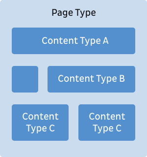
This is why we want to focus on the overall structure. For us that means we use the sitemap to define page types and the page types to define content types.
Page types are like outlines or structures of different pages. When you edit the website in TYPO3 and want to create a new page, you have to choose the page type. For example you might have a page type for case studies to ensure that all case studies are structured in the same way.
For every page type we define the content types that are possible on that page. Those make up the structure of the page type. With the case study example, you could define that a case study page allows text elements, download elements and teasers to other case studies.
By defining different page types and the content types on them, we can guide website visitors to necessary or helpful information on particular pages, even if the sitemap changes.
Displaying all of this in a sitemap can get rather confusing, which is why the IA is often represented as wireframes and user flows.
The right information at the right time
With all the information our clients want to provide on their website, it can be difficult to prioritize what to show at what point. It’s easy to think that everything is equally important and should be displayed as prominently as possible.
But users get overwhelmed easily. If we provide too much information and too many choices at once, it makes it harder for the users to find the information they actually want or need. They can quickly get frustrated and bounce—abandoning their shopping cart or leaving a form unsubmitted. The key is to present the right information at the right time. In the discovery phase of each project we try to get as much data about the users as possible, and identify their needs. Based on this we can make confident decisions about the information they need at any given stage of their journey.
Just as a page on your website shouldn’t provide too many options to go further, it should also never be a dead end. It should always be clear to the users how they can proceed further to achieve their goal. Even if they just finished their task, always provide a point where they can find further information or discover something new.
Get everyone on board
We work closely together with our clients throughout the entire UX process which of course includes IA. It’s important for us to share it early and often so that we can include different viewpoints and get everyone involved. We don’t simply share the sitemap and some wireframes, we always share our reasoning behind decisions on why elements and pages are structured and positioned in a certain way. This means that even if the general structure of the website changes over time, the users‘ needs are still considered. Sharing our rationale for the placement of content means that our clients can test the IA using analytics to measure the success of their goals, and adapt and iterate.
Allow for flexibility and growth
Websites are a living and ever changing product. Pages can be added or deleted and new categories might be introduced. The Information Architecture therefore isn’t something that’s just finished and will remain untouched. As the website grows, we need to check in from time to time to see if the structure still makes sense. We look for opportunities to adapt and finetune it to make sure the users‘ needs are still being met.
It’s never too late to get on top of your IA, so if you feel like the structure of your website has grown a bit out of hand.
Laura personifies the best qualities of her UX work: genuine, to the point, and effective. She gets to the bottom of client needs and turns them into simple, essential interfaces that get the job done right. Her essential tool: Adobe XD
Designing TYPO3 14’s Backend: Our Vision for a Modern, Expandable Foundation
|Laura Heine
b13 is redesigning TYPO3’s backend for version 14 to feel modern, work faster, maintain user context, and create an expandable foundation that can evolve for years to come.
Effective web form design is a critical component of user engagement and conversion. By focusing on clarity, simplicity, and user experience, businesses can create web forms that…
Designing an Effective Information Architecture: Best Practices
|David Steeb
Dive into our latest article exploring the world of information architecture and its profound impact on user experience. Learn key strategies and best practices for designing…
Designing with Type: A Guide to UI Font Size Guidelines
|David Steeb
Discover the importance of UI font size guidelines for creating accessible and visually appealing UI designs. Learn the best practices for typography in UI, including consistency,…
Mastering the Art of Wireframing: Essential Tips and Technique
|Stefanie Kreuzer
Wireframing is the first step in designing the structure of a website, and it serves many purposes; to describe how information is presented on a page, to determine a website’s…
A Guide to Accessibility Considerations in UX Design
|Franzi Töpler
People with disabilities constitute one of the most significant segments of online users, but it is an often-overlooked population in the digital world. Increasing accessibility to…
User flow design visualizes the path that the user follows to achieve a specific goal. In digital terms, the path is what the user sees and clicks on when interacting with a…