New UX Concept for the Page Tree in TYPO3
by Laura Heine, b13, December 2020
Introduction
TYPO3 is known as a CMS that displays content in an organized and structured way. Key to this is the TYPO3 Page Tree which already serves as a competitive advantage. However, UI and UX of the Page Tree are outdated and offer huge potential for improvement. This concept builds on the existing strengths of the Page Tree but focuses on an improved UX and UI based on the results of a previously conducted UX-based benchmark of other CMS and common UX-patterns.
2 Definition of Terms
![Definition of Terms for the TYPO3 backend view Dashboard interface displaying a module menu on the left, a page tree listing items, and a content area on the right labeled "[Default Title]" with an option to add content.](/fileadmin/core-insights/concepts/page-tree/definition-of-terms-for-the-backend-view-of-typo3.png)
3 Page Tree Structure
The Structure of the Page Tree will be redesigned to shorten click paths and display information and functionalities based on context. Altogether, the structure will only be changed so far, that these goals are reached but still be similar enough for users to still find the functions where they know them to be.
![Redesigned Page Tree for TYPO3 A user interface displaying a content management system with a sidebar menu for navigation, featuring options like Dashboard, Pages, and Settings. The main area shows a document titled "[Default Title]" with placeholder text.](/fileadmin/_processed_/e/8/csm_redesigned-page-tree-for-typo3_22077a5f42.webp)
The Page Tree can still be hidden though this function is no longer in the topbar. Instead it is displayed context based directly at the Page Tree. If the Page Tree is hidden there is a small bar next to the module menu that includes an icon which will show the Page Tree again.
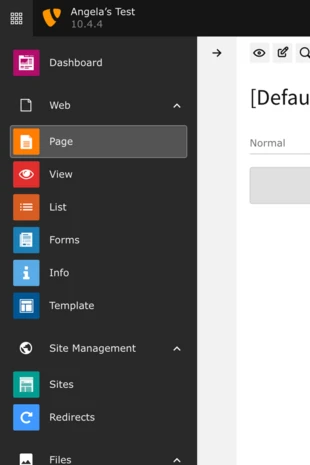
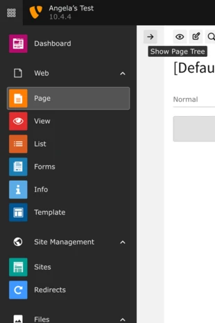
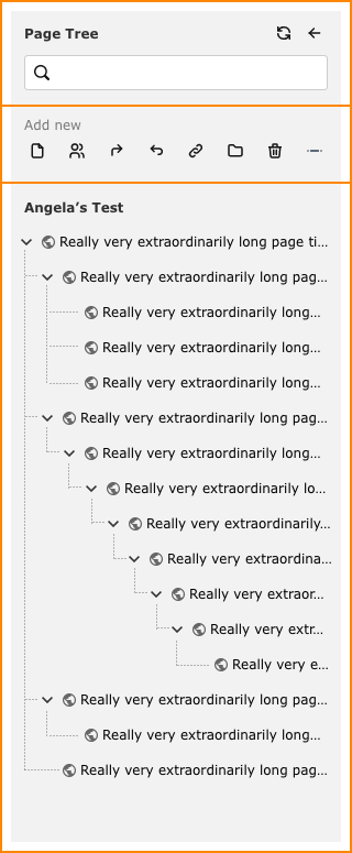
Dragging the right border of the Page Tree will allow the user to make it smaller or bigger, making it possible to display even very long page titles completely. The initial size of the Page Tree is “magnetic” to help restore the original width. If the user toggles the visibility of the Page Tree, the original size is also restored. The minimal width is defined by the space all “add new”-icons need to be displayed next to each other.
The Page Tree itself can be vertically split up into three different sections. The existing “add new” and “filter” tabs are dissolved and instead will be displayed below each other. In this way the search bar of the filter gets the top position and is always visible, which corresponds with common UX principles. Below is the “add new” area in its already existing form and finally the actual page tree. This structure makes it possible to show all functions at first glance.
4 Filter
The search bar at the top of the Page Tree serves as a filter to all the pages. After entering a search term all pages that include the phrase are shown in the results, the search term itself is highlighted. The resulting pages are displayed in the Page Tree, which is still usable. This means that subpages can still be expanded and selected.
The “X”-icon in the search bar resets the filter and restores the original page tree.
![Redesigned Page Tree with Active Filter (TYPO3) A web interface displaying a dashboard with a sidebar menu. The main area shows a document titled "[Default Title]" with placeholder text labeled "Angie's Test" and multiple entries of "Really very extraordinarily long page text."](/fileadmin/_processed_/b/8/csm_page-tree-with-active-filter_96c0979668.webp)
5 “Add new” section
The “add new” section keeps the same functions as until now, meaning different page types can be added at a certain place in the page tree via drag and drop. Only the icons get a rebrush to simplify them.

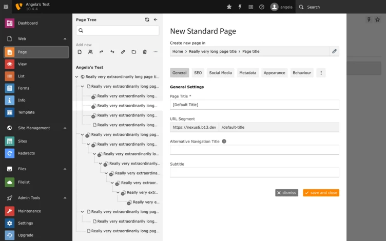
There is however some change after the page type gets dragged into the page tree. Instead of directly creating a page, the page properties will be displayed in an overlay.
5.1 Page properties
In this overlay all the mandatory fields have to be filled in to create a new page. The different areas of the page properties are displayed in a horizontal navigation above the input area. If there are too many areas to fit into one row, the ones that don’t fit anymore are hidden behind a “more”-icon. In this way users don’t get overwhelmed by too many options. Mandatory fields that haven’t been filled in yet get marked with an exclamation mark next to the corresponding tab.
The overlay also includes the path where the new page will be inserted. This path can be changed through clicking on the icon next to it.
If all mandatory fields are filled in the new page can be created by clicking “save and close”. “Dismiss” on the other hand initiates a pop up dialogue asking the user if all changes should be discarded or if the user wants to keep editing the page properties.

5.1.1 Edit path
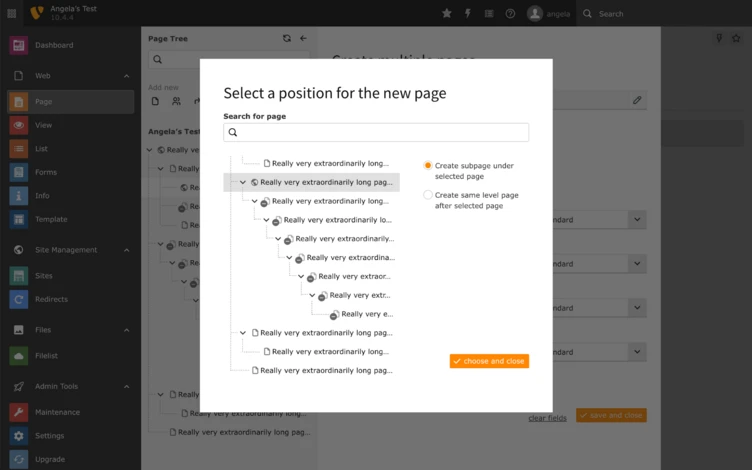
The position of the new page can be changed by altering the path though clicking on the icon next to it. This opens a layer displaying the page tree, a search bar to filter it and two radio buttons to choose whether the page should be placed on the same level below the selected page or as a subpage. If it is to be placed as a subpage it will always be inserted as the last subpage.
To make it easier for the user to find the right page even in large instances there is a search bar on top of the page tree which works just like the filter described in 4.
6 Page Tree
The Page Tree itself will be redesigned to be more spacious and therefore easier to use and more accessible.
Single pages can still be moved and resorted via drag and drop. To indicate that there will be a little bar on the left border visible on hover.
The icons of the page types will be updated in line with the icons in the “add new” section, other than that the structure of a page entry stays the same.
On hover pages are not only highlighted but also there are quick actions available to the user.

Right click on a page opens the context menu as usual, but in a redesigned version. To enable quick actions and the context menu on mobile and touch devices without hover function there is another icon added to the doc header next to the icons for “preview”, “edit”, and “search”. The icon shows the options to add further pages and the menu items of the context menu.
![Icons for More Function in the TYPO3 Doc Header A user interface displaying a text editor with a title placeholder labeled "[Default Title]" and a section for adding content. The sidebar includes options for navigation and editing tools.](/fileadmin/_processed_/f/6/csm_docheader-icons-typo3-page-tree_86647fbbba.webp)
6.1 Quick Actions
The quick actions enable access to the functions “add new”, “edit”, and “preview” on hover on a page entry.
“Edit” opens the page properties as described in 5.1 and “Preview” opens the page preview in a new tab. “Add new” offers three possible actions to add new pages to the Page Tree.
6.1.1 Add New
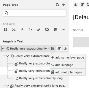
There are three possibilities to add new pages. A click on the icons shows a context menu which allows the selection between “add same level page”, “add subpage”, and “add multiple pages”.
“Add same level page” and “add subpage” basically start the same process, only the position where the new page is added differs. The new page will either be on the same level below the selected page or a subpage of the selected page. Both actions open an overlay in which the page type can be chosen.

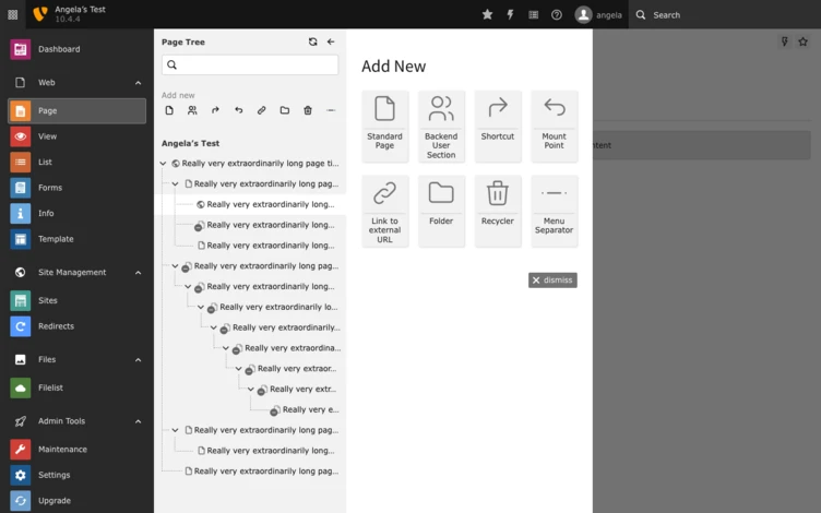
After a page type was selected, the page properties overlay described in 5.1 opens.
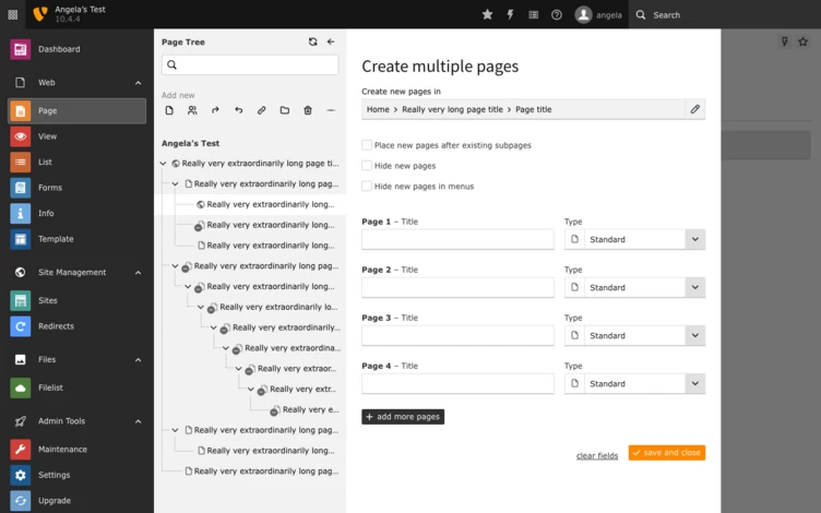
“Add multiple pages” makes it possible to add several pages at once to the Page Tree.
The function is basically the same as the already existing one in TYPO3, but it will be opened in an overlay as well. The position of the pages can be changed as well with the same overlay as described seen in Figure 9.
6.2 Context Menu
Right clicking on a page entry opens the context menu as usual. The addition of the quick actions means that the context menu can be reduced. As it then includes less function the second level under “more” can be omitted. The functions that were hidden so far can now be included in the main level. To group thematically related functions the context menu will also be restructured.
![TYPO3 Page Tree Context Menu A user interface displaying a page tree with various options for managing content, including "Copy," "Cut," "Delete," and "Export." The main section shows a title labeled "[Default Title]" and a prompt to add content.](/fileadmin/_processed_/1/7/csm_typo3-page-tree-context-menu_937bc2c6c7.webp)