---
title: How to implement complex page layouts and substructures in TYPO3
url: "https://b13.com/knowledge/flexible-containers-and-grids-for-typo3-part-two"
description: How to add complex page layout substructures using the TYPO3 Container Extension. Part 3 of our series.
image: "https://b13.com/fileadmin/_processed_/a/4/csm_Container_pt3_191-1_5bc20680fb.png"
date: 2020-07-21
modified: 2026-08-19
lastUpdated: 2026-08-19
---
# How to implement complex page layouts and substructures in TYPO3
[ Container ](https://b13.com/knowledge/container) [ CType ](https://b13.com/knowledge/ctype) [ TYPO3 ](https://b13.com/knowledge/typo3)
Flexible Containers and Grids for TYPO3, Part Three
=====================================================
David Steeb
22 July 2020
[ RSS Feed ](https://b13.com/rss.xml)

**Advanced example: How to add complex substructures to a page.** In [Part 1 of this series](https://b13.com/knowledge/flexible-containers-and-grids-for-typo3), we introduced you to our Container extension (and when not to use it!). We talked about why we created it and how you can add simple container elements for structuring content. In [Part 2](https://b13.com/knowledge/flexible-containers-and-grids-for-typo3-part-two), we took you through a quick example: adding a simple 2-column substructure to a page and saving content elements into it.
In this third post, I want to show you some advanced use cases, how container elements help us create a clean and intuitive backend experience for editors, and why we love the “core-near” way container elements are created by our extension (hint: cleaner code and smoother, less risky upgrades).
#### This post is part of our Container Series
- [Part 1: Flexible Containers and Grids for TYPO3](https://b13.com/knowledge/flexible-containers-and-grids-for-typo3)
- [Part 2: Flexible Containers and Grids for TYPO3—Basic Example](https://b13.com/knowledge/flexible-containers-and-grids-for-typo3-part-two)
- **[Part 3: Flexible Containers and Grids for TYPO3—Advanced Example](https://b13.com/knowledge/flexible-containers-and-grids-for-typo3-part-three)**
Advanced Container Configuration Use-Case
-------------------------------------------
The need for subsections of a page being displayed in a two-column layout is an obvious use-case for any multi-column-extension. In the projects we tackle at b13, we encounter some complex “element combination block” requirements in the frontend. Our designers also seem to have a knack for challenging us and pushing the edge of the envelope. As TYPO3 integrators, we strive to create flexible backend and content element structures. We want to allow for all the potential desired combinations of content types that we (or our designers) want to see while keeping the available options and layouts to a minimum. We have seen too much flexibility lead to editors being able to (unintentionally) break the design, especially with large teams working in a TYPO3 backend. We try to make the editors‘ choices as clear and robust as possible.
**For this example, let us assume we are building an online corporate design manual.**
- The design manual will have pages for various different design elements, colors, buttons, fonts, paragraphs, etc.
- Each page may consist of multiple (sub) sections with detailed descriptions and guidelines, as well as featuring examples.
- Each page section may have a headline, a general description text, cross-reference links, related downloads, and the content itself, which can consist of various elements and content types.
**So by definition, we have**
- Some page areas that can only be filled once by an editor (each element should only have one headline, one description text, and one set of links, for example).
- And other areas where the editor might need to add several other content elements.
**Any given page in the corporate design manual** can have multiple sections (product teasers, news teasers, event teasers, contact teasers, etc.) with a mix of content types.
For this example design, shown below, we are talking about a page template divided into sections, each representing substructures. Each section can have a headline, an introduction text, various content elements in the main column, and more optional content in a sidebar-column.
If we only had a single structure like this, we would start with a regular backend layout. Since this structure is a content block that can be placed (and customized) on the same page multiple times, we create a container element. Using a container, we have an element with a unique uid, letting us use TYPO3’s in-page section-links to create in-page menus or links across pages to the specific anchor in question.
Here’s a design screenshot that shows what we’re aiming for:
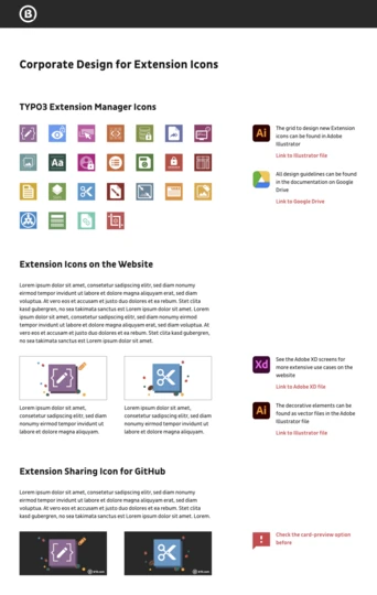 Figure 1: Corporate Design Manual Page Layout
Configure the Container Element
---------------------------------
Here’s the TCA for our example container element:
```
1
2
3
4
5
6
7
8
9
10
11
12
13
14
15
16
17
18
19
20
21
22
23
24
25
26
27
28
29
30
31
32
33
34
35
36
37
38
39
40
41
42
```
```
\TYPO3\CMS\Core\Utility\GeneralUtility::makeInstance(\b13\Container\Tca\Registry::class)->configureContainer(
(
new \b13\Container\Tca\ContainerConfiguration(
'cd-detail-section',
'CD Detail Section',
'Insert a detail section for Corporate Design Elements',
[
[
['name' => 'Main Column', 'colPos' => 201, 'allowed' => ['CType' => 'textmedia,cta,text,image,bullets,cd_text,footnotes']],
['name' => 'Sidebar Content', 'colPos' => 202, 'allowed' => ['CType' => 'text,sidebar-image']]
]
]
)
)
->setIcon('EXT:site_cdmanual/Resources/Public/Icons/CD-Detail-Section.svg')
->setBackendTemplate('EXT:site_cdmanual/Resources/Private/Container/Templates/Cd-detail-section.html')
);
$GLOBALS['TCA']['tt_content']['types']['cd-detail-section']['showitem'] = '
--div--;LLL:EXT:core/Resources/Private/Language/Form/locallang_tabs.xlf:general,
--palette--;;general,
--palette--;;headers,
bodytext;LLL:EXT:frontend/Resources/Private/Language/locallang_ttc.xlf:bodytext_formlabel,
--div--;LLL:EXT:frontend/Resources/Private/Language/locallang_ttc.xlf:tabs.appearance,
--palette--;;frames,
--palette--;;appearanceLinks,
--div--;LLL:EXT:core/Resources/Private/Language/Form/locallang_tabs.xlf:language,
--palette--;;language,
--div--;LLL:EXT:core/Resources/Private/Language/Form/locallang_tabs.xlf:access,
--palette--;;hidden,
--palette--;;access,
--div--;LLL:EXT:core/Resources/Private/Language/Form/locallang_tabs.xlf:categories,
categories,
--div--;LLL:EXT:core/Resources/Private/Language/Form/locallang_tabs.xlf:notes,
rowDescription,
--div--;LLL:EXT:core/Resources/Private/Language/Form/locallang_tabs.xlf:extended,
';
$GLOBALS['TCA']['tt_content']['types']['cd-detail-section']['columnsOverrides']['bodytext']['config'] = [
'rows' => 5,
'enableRichtext' => true,
];
```
Comparing this to [what we did in Part 2 with the simple 2-column container](https://b13.com/knowledge/flexible-containers-and-grids-for-typo3-part-two), you will immediately notice two significant differences:
1. The container configuration object itself makes use of additional methods, including setting a backend Fluid Template and a CType icon.
2. We add a regular “showitem” configuration for the container CType.
We also use additional column configuration to restrict the types of elements allowed within a specific content area. You can only do this if you install Nicole Cordes’s [Content Defender Extension](https://github.com/IchHabRecht/content_defender). This handy extension is one of our house favorites at b13, and we use it in all of our projects.
Add a “showitem” Container CType Configuration
------------------------------------------------
The container registration process sets a default configuration for a container element’s visible fields. Adding a “showitem” configuration to the content type’s TCA configuration allows us to add the fields we need to the container itself. In our example, we add the field header, a bodytext field for an introduction, and a layout field. We are working “core near,” with a standard CType for these containers, so we can add all the fields available in table `tt_content`.
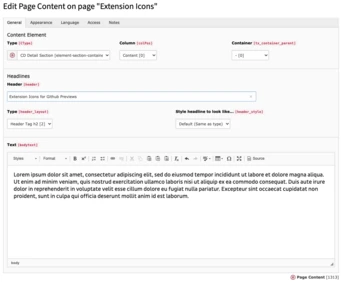 Figure 3: Backend Form for our container element.
This example includes a complete set of fields. You do not need to add everything here to make this work, but you should include the language field if you’re working on a multi-language website and the “general” palette, which contains the “CType” and “colPos” fields.
Create the Backend Preview
----------------------------
Setting a custom backend Fluid template enables us to define our own backend layout for the Page Module. With it, we can show editors the container content areas, and the other available fields in our container element. Our custom Fluid template also lets us format these element previews freely.
Here’s a sample Fluid template for the element we just added:
```
1
2
3
4
5
6
7
```
```
<html data-namespace-typo3-fluid="true">
<a href="{editLink.url -> f:format.raw()}" title="{editLink.title}">
{bodytext -> f:format.nl2br() -> f:format.stripTags()}
a>
{tx_container_grid -> f:format.raw()}
html>
```
This means that the Fluid template used to render the backend preview of our container element can access all the standard fields in the `tt_content` database record. Our Container extension adds one more variable, called `tx_container_grid`. This variable holds the container grid (in this case, including the two columns defined in the container setup) as a complete HTML block, together with all the child elements and options to create new elements. In this example, we add additional preview content (our bodytext field) to the overall element preview before rendering the container grid HTML.
Here’s how editors see our container element in the TYPO3 backend Page Module:
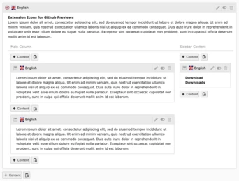 Figure 5: Element preview for our container with custom backend template
Potential Further Configuration
---------------------------------
There are additional methods you can use when registering a container:
- `setGridTemplate` to use a custom Grid Fluid Template
- `setSaveAndCloseInNewContentElementWizard` to set the “saveAndClose” option for the New Content Element Wizard for TYPO3 v10+ (default: `true`)
- `setRegisterInNewContentElementWizard` to set automatic element-registration in the New Content Element Wizard (default: `true`)
- `setGroup` to add your container element to a specifc CType group and move it to specific tab in the New Content Element Wizard (default: `container`)
### Grid Fluid Template
The default Grid Template for a container’s backend page module preview works similarly to how backend layouts are processed: It divides the element area into rows and columns based on the configuration set during registration in the TCA. You can expect this to work for most of your elements—as you’ve seen in our example above, you can combine content from other fields with a container grid view in the backend element preview. Still, there will be that unique scenario every now and then where the default layout is not ideal. You might want to add some CSS to change the editor’s preview based on the screen size, or you have a complex element that combines “regular” `tt_content` field values with specific content areas of your container.
This is where the seventh parameter comes in: You can set your own grid template for such cases to change the default grid layout. The default template can be found in `EXT:container/Resources/Private/Templates/Grid.html`. This simple template (it iterates over rows and columns) generates the output for the backend grid view.
You can change the grid template any way you want, like, for example, adding a text to one of the columns like this:
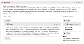 Figure 6: Custom Backend Grid Template
### Disable the Save and Close option
The Container extension makes use of the new “saveAndClose” argument in the TYPO3 v10 for the New Content Element Wizard (see item 13 in [13 Little Things We Love in TYPO3 v10](https://b13.com/knowledge/13-little-things-we-love-about-typo3-v10#c886) to learn more about this little gem). By default, it is set to “true.” When adding a new container, you can disable the “saveAndClose” setting by using the `setSaveAndCloseInNewContentElementWizard` method.
### Disable Automatic Inclusion in the New Content Element Wizard
Every container element you create will be added to the New Content Element Wizard automatically, using the configuration details provided in the TCA registration. In case you want to modify this behaviour—e.g., to move a container item to another tab in the wizard, reorder the items within the tab, or for some other reason—use the method `setRegisterInNewContentElementWizard` to disable this beviour. The container won’t be added to the New Content Element Wizard automatically, but you can add it yourself in your PageTSConfig configuration.
Move a Container Element into Another Group
---------------------------------------------
By default, all container elements you create will be listed in a tab (and a corresponding CType group) called “container.” If you want to change that for a specific element, use the method `setGroup` to move the element into another group and tab.
Want More? Want to Get Involved?
----------------------------------
In the three parts of this series about Flexible Containers and Grids for TYPO3, we introduced the basic concepts around layout “containers” for TYPO3, when you might need more than core offers by default, how our Container extension provides a clean “core-near” solution and provided simple and more complex examples of implementing Container in your projects. Now that you’ve read them all, go and try it out for yourself!
And what if you’ve found a bug in Container? (Gasp!) Or need a missing feature? Did we forget something else? Get in touch! [Head on over to GitHub](https://github.com/b13/container), open an issue and create a pull request!
Thanks in advance for your critical eye and your contributions. It all helps us make our favorite open source project better for everyone.
### Written by:

b13 Founder and CEO, David, is someone you’ll meet if you’re thinking about working with our agency. He is constantly learning new skills and is an influential part of our cutting-edge frontend practice.
David Steeb CEO
[ more from David Steeb ](https://b13.com/team/david-steeb)
Related Articles
------------------
- 
### T3ppy Gives TYPO3 a Friendly Face
06 August 2026 | Florian “Flix” Keitgen
TYPO3 is powerful—but it doesn’t have to feel impersonal. Meet T3ppy, our friendly companion for the backend.
[ Read more: T3ppy Gives TYPO3 a Friendly Face ](https://b13.com/knowledge/t3ppy-design-kit)
- 
### AI Content in TYPO3: Labelling Needs Accountability
02 August 2026 | Benni Mack
The EU AI Act brings the origins of AI-generated content into focus. AI Label marks AI-generated and AI-edited content in TYPO3 and records who signed off the published version—for…
[ Read more: AI Content in TYPO3: Labelling Needs Accountability ](https://b13.com/knowledge/ai-content-in-typo3-labelling-needs-accountability)
- 
### Better scalability with decoupled queues: How to set up RabbitMQ with TYPO3
10 April 2024 | Jochen Roth
When built-in message transports hit their limits, RabbitMQ can provide TYPO3 with a scalable, robust message queue.
[ Read more: Better scalability with decoupled queues: How to set up RabbitMQ with TYPO3 ](https://b13.com/knowledge/better-scalability-with-decoupled-queues-how-to-set-up-rabbitmq-with-typo3)
- 
### Meet T3ppy: A New Era for Editorial Work in TYPO3
01 April 2026 | Florian “Flix” Keitgen
T3ppy and the AiM extension bring AI directly into the TYPO3 backend—enhancing SEO, content quality, and workflows with centralized control.
[ Read more: Meet T3ppy: A New Era for Editorial Work in TYPO3 ](https://b13.com/knowledge/meet-t3ppy-a-new-era-for-editorial-work-in-typo3)
- 
### Why TYPO3 Needs a Marketplace for Products
25 March 2026 | Florian “Flix” Keitgen
A marketplace would make TYPO3 products more discoverable, easier to compare, and benefit both agencies and clients alike.
[ Read more: Why TYPO3 Needs a Marketplace for Products ](https://b13.com/knowledge/why-typo3-needs-a-marketplace-for-products)
- 
### Unlocking TYPO3’s Hidden Gem: The Backend User Section (Doktype 6)
05 March 2026 | David Steeb
Discover TYPO3’s underrated doktype 6 (Backend User Section) for secure internal previews, editor training, and prototyping. Learn real use cases, common pitfalls like 403 errors…
[ Read more: Unlocking TYPO3’s Hidden Gem: The Backend User Section (Doktype 6) ](https://b13.com/knowledge/backend-user-section-in-typo3-uses-pitfalls-helper)
- 
### Backend Previews With a System—Why We Built EXT:backendpreviews
09 February 2026 | David Steeb
EXT:backendpreviews brings structure and consistency to content previews in the TYPO3 backend using Fluid templates, layouts, and partials.
[ Read more: Backend Previews With a System—Why We Built EXT:backendpreviews ](https://b13.com/knowledge/backend-previews-with-a-system-why-we-built-extbackendpreviews)
- 
### The Internet Is No Longer Just for Humans—AI Bots Love Markdown
28 January 2026 | Benni Mack
Discover why most web traffic is now automated and how TYPO3’s structured content model prepares websites for humans, editors, and AI systems.
[ Read more: The Internet Is No Longer Just for Humans—AI Bots Love Markdown ](https://b13.com/knowledge/the-internet-is-no-longer-just-for-humans-ai-bots-love-markdown)
- 
### Camino—The Need for a Default Theme in TYPO3 Is Real
27 January 2026 | Benni Mack
With TYPO3 v14, Camino introduces a default theme that removes friction from first installs. Why this matters—and how TYPO3 laid the groundwork.
[ Read more: Camino—The Need for a Default Theme in TYPO3 Is Real ](https://b13.com/core-insights/blog/camino-the-need-for-a-default-theme-in-typo3-is-real)
- 
### T3CON25—One Step Closer to the Future of Content Management
10 December 2025 | Franzi Töpler
T3CON25 showcased the future of TYPO3 with insights on TYPO3 v14, AI, digital sovereignty, and open-source solutions driving secure, modern web experiences.
[ Read more: T3CON25—One Step Closer to the Future of Content Management ](https://b13.com/knowledge/shaping-the-future-of-content-management-t3con25)